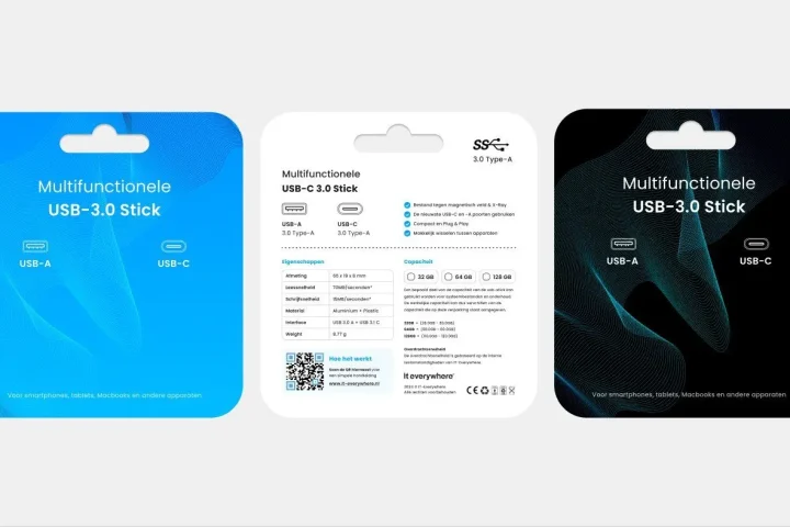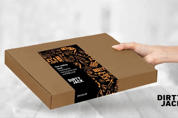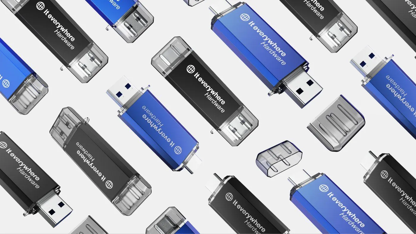
Packaging for Bol and Amazon has to be marketplace-proof first
In practice, packaging for Bol and Amazon is rarely about a platform rule in itself. The core question is usually much simpler: does your packaging stay clear, recognisable and credible when a customer does not see it in their hand, but first in a listing image, thumbnail or product grid?
That is exactly where it often goes wrong. Brands design packaging that feels good in a physical presentation but gives too little direction online. The brand is too subtle. The product type comes through too late. The variant gets lost. Or the front carries so many competing signals that it becomes restless in a marketplace setting. Then the packaging is not necessarily bad, but it is not marketplace-proof.
So by marketplace-proof we do not mean that packaging only meets logistical or technical platform requirements. We mean that the packaging also holds up commercially in the visual environment of Bol and Amazon-style marketplaces. It has to build recognition quickly, support understanding of the product and not get in the way of the first click.
For the broader basics of strong packaging design, designing product packaging is the natural companion. This page zooms in more specifically on what packaging has to do differently once sales run mainly through marketplaces and listing images.
Why marketplace packaging asks for something different from shelf packaging
Packaging designed for the shelf can often rely on the feel of the material, proximity and physical attention. Someone walks past, picks the product up, turns it around and sees more than just the front. On marketplaces, almost the opposite happens. The first point of contact is small, fast and often flattened into a main image among competitors.
That fundamentally changes the role of packaging. In a marketplace grid, the front needs to be clear rather than rich. The brand has to land faster. The product type has to be understood faster. And variants have to be handled less subtly if they otherwise blur into each other online. What feels refined on a shelf can turn out to be too slow in a listing.
On top of that, marketplaces strip away a lot of context. The environment is standardised. Image space is limited. Competitors sit literally next to you in the same layout. Your packaging is not only competing with other packaging there, but also with price, title, stars and delivery information. That makes the first visual impression harsher and less forgiving.
If you first want to see the broader channel differences between the two platforms side by side, the differences between Bol and Amazon is a logical next read. This page deliberately sticks to packaging as a visible sales layer within that channel context.
The comparison below shows clearly why shelf logic is not automatically marketplace logic.
| Element | Shelf-focused approach | Marketplace-ready approach | Effect on listing or choice |
|---|---|---|---|
| First impression | More detail and atmosphere up close | Fast recognition and a clear front | Better scannability in grids |
| Product understanding | Understanding can partly come from physical inspection | Product type has to be visible faster | Less doubt at first glance |
| Variant difference | Subtle differences can still work | Variant has to stay distinct even at a small size | Less confusion between options |
| Role of the brand | Brand can rely on physical context | Brand has to land visually faster | Stronger recognition among competitors |
| Channel fit | Packaging is mainly designed for the shelf or unboxing | Packaging also works in packshots and thumbnails | More commercial usefulness |
What makes packaging clearer in listing images and thumbnails
Clarity in marketplace images usually does not start with more design, but with better prioritising. Packaging works harder when the most important layer still holds up at a small size. That means brand, product type and variant must not all fight for the first glance at the same time.
So the first question is what someone needs to understand straight away in a listing image. Do they see immediately what kind of product this is? Do they recognise the brand quickly enough? Do they sense the difference between variants right away? As soon as packaging creates too much friction on those three points, the chance that someone looks further, compares or clicks goes down.
Blocks of colour, contrast, composition and the position of the product name play a bigger role in this than many brands think. Packaging does not have to be loud, but it must not disappear either. Subtle details, fine typography and complex layers of atmosphere lose their power online faster than on a desk or shelf. Marketplace-proof packaging therefore makes sharper choices about what must stay visible once the image gets smaller.
For the broader visibility angle, packaging that stands out in e-commerce is the natural companion. That piece is more about recognition, click value and a premium feel in e-commerce in general. Here the emphasis is on the marketplace context, where the same choices get even less room to be understood slowly.
How to align your packaging with product images and main images
On marketplaces, packaging never works separately from the main image. It is part of the overall listing presentation. As soon as packaging and product image tell different stories, you get noise. The packaging may look strong on its own, but it does not support the listing as well as it could.
Alignment starts with consistency. Whatever plays the lead role on the packaging must also hold up in the main image. If a product name on the front is important but visually disappears in the packshot, recognition is lost. If the variant colour on the packaging is key but stays too subtle in the listing image, the customer loses a quick aid to choosing.
The cropping and proportions of marketplace images also play a part. Some packaging only works well when it is fully visible, but listings do not always leave room for that. Then the front still needs to stay clear when an image becomes tighter, smaller or visually busier. Packaging design and product photography therefore need to work together, not come about separately.
For that broader visual translation into marketplace performance, increasing marketplace conversion is the natural companion. That page looks more broadly at listing output and things that speed up a choice. This page sticks to the role of packaging within that visual framework.
How brand, product and variant hold up on marketplaces
On marketplaces, brand, product and variant get pulled apart faster if the packaging has no clear logic for them. What can still be rescued in a web shop with extra context, explanation or more images often has to be clear within the first few seconds on a marketplace.
The brand has to be recognisable without blocking the front. The product type has to be visible faster than decorative details. The variant has to differ clearly enough without breaking the family feel. As soon as one of those three layers becomes too weak or too dominant, you lose balance. Then a listing feels confusing rather than convincing.
That tension ties in directly with packaging hierarchy. There we look more closely at the order of brand, product and variant on the packaging itself. And if you work with several flavours, colours or versions, this topic also touches on packaging for product variants.
So marketplace-proof packaging does not mean every product has to shout louder. It means you make it clear faster what belongs together, what differs and why this product deserves attention at all among competing listings.
The difference between beautiful packaging and marketplace-ready packaging
Beautiful packaging can still perform poorly online. This mainly happens when a design is built around atmosphere, refinement or detail, while the sales context calls for fast scannability. So packaging can be aesthetically strong and still communicate too slowly for a marketplace.
Marketplace-ready packaging makes different choices. It stays attractive, but sacrifices just enough nuance to gain clarity. It depends less on physical proximity. It takes packshots, main images and the competition in grids into account. And it makes sure the first layer of content comes through faster than the second or third.
That does not make marketplace-ready the same as simplistic. Quite the opposite. It often takes more design discipline. You have to choose more consciously what can be large, where contrast belongs and which layer does not need to come forward. The question is then not: how do we make this even more beautiful, but: how do we make this more beautiful and more usable in a marketplace context.
For the basics of that design trade-off, designing product packaging is the natural companion. This page builds on it by looking specifically at channel fit for Bol and Amazon-style sales environments.
Common mistakes with packaging for Bol and Amazon
The first common mistake is that brands treat marketplace sales as if they are just adding an extra distribution channel. The packaging then stays the same in content, while the viewing context changes completely. That often leads to listings in which brand, product or variant do not land quickly enough.
A second mistake is relying too much on atmosphere or detail. Packaging is then designed for a close-up experience, while the first real test is a small main image. Less of the design survives online than hoped, and the listing has to win back clarity somewhere else.
A third mistake is channel-blind uniformity. Brands then insist on using exactly the same front everywhere, even if it does not work well enough on marketplaces. Consistency is valuable, but it should not mean that packaging has to carry obvious shortcomings in listing images out of fear of changing anything.
Also common: too little alignment between packaging and product images. Then the packaging tries to say something the listing photos do not confirm, or the other way round. The result is not necessarily ugly, but it is fragmented. Marketplace customers feel that immediately, often without being able to say exactly why.
When to adapt your packaging for marketplace sales
Not every pack needs a redesign as soon as a brand starts selling on marketplaces. But there are clear signs that adapting it pays off. For example, when variants look too similar in main images, when the product type becomes clear too late at a small size, or when the packshot has to lean much more heavily on extra listing text than is desirable.
A difference between physical and online performance can also be a clue. If a product feels convincing in a shop or showroom but gets less traction on marketplaces despite reasonable content and pricing, part of the problem sometimes lies in the packaging as the visual carrier of understanding and recognition.
What’s more, adapting does not always have to mean a complete redesign. Sometimes the gain lies in a clearer hierarchy, stronger contrast, better variant logic or a front that works better with the main image. Making packaging marketplace-proof is therefore often more about sharpening than replacing it entirely.
Frequently asked questions
What makes packaging suitable for Bol and Amazon?+
Packaging is suitable for Bol and Amazon when brand, product type and variant stay clear quickly in listing images and main images too. So it is less about separate platform rules and more about marketplace-proof recognition and scannability.
Should you adapt your packaging for marketplace sales?+
Not always. But if your packaging builds too little recognition online, variants blur into each other or the product type becomes visible too late, sharpening it up is often wise.
What is the difference between shelf packaging and marketplace packaging?+
Shelf packaging can lean more on physical proximity, the feel of the material and detail. Marketplace packaging has to work faster in small images, product grids and standardised listing environments.
How does packaging help clicks and conversion on marketplaces?+
Packaging supports clicks and conversion when it delivers product understanding, recognition and variant clarity faster. It then reduces friction at first glance and helps the listing feel more professional.
How do you align packaging with product images?+
By making sure the most important layer of the packaging also holds up in the main image. Whatever is key on the front must still be visible and understandable in packshots and thumbnails.
When is help with marketplace-proof packaging worthwhile?+
As soon as packaging not only has to look neat, but also has to actively contribute to listing quality, recognition and channel fit across Bol, Amazon and other marketplaces. Want to make that concrete for your own products? Book an intake call.
Conclusion
Packaging for Bol and Amazon only really works when it is not just beautiful, but marketplace-proof as well. That means brand, product and variant stay visible quickly enough in listing images, main images and competing grids.
If you approach packaging this way, you use it not as decoration but as a sales layer. Want to turn that step into stronger product packaging that works better on marketplaces? We are happy to think along with you.

Melle Sikma
Helmsman
melle@brandmonks.nl