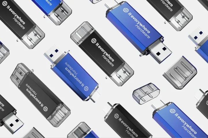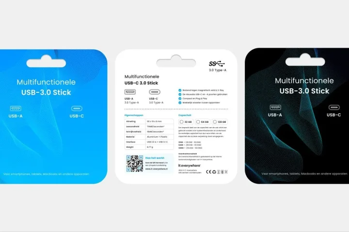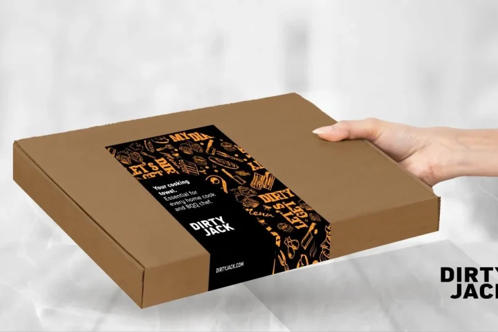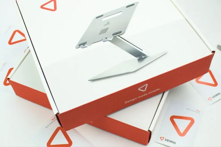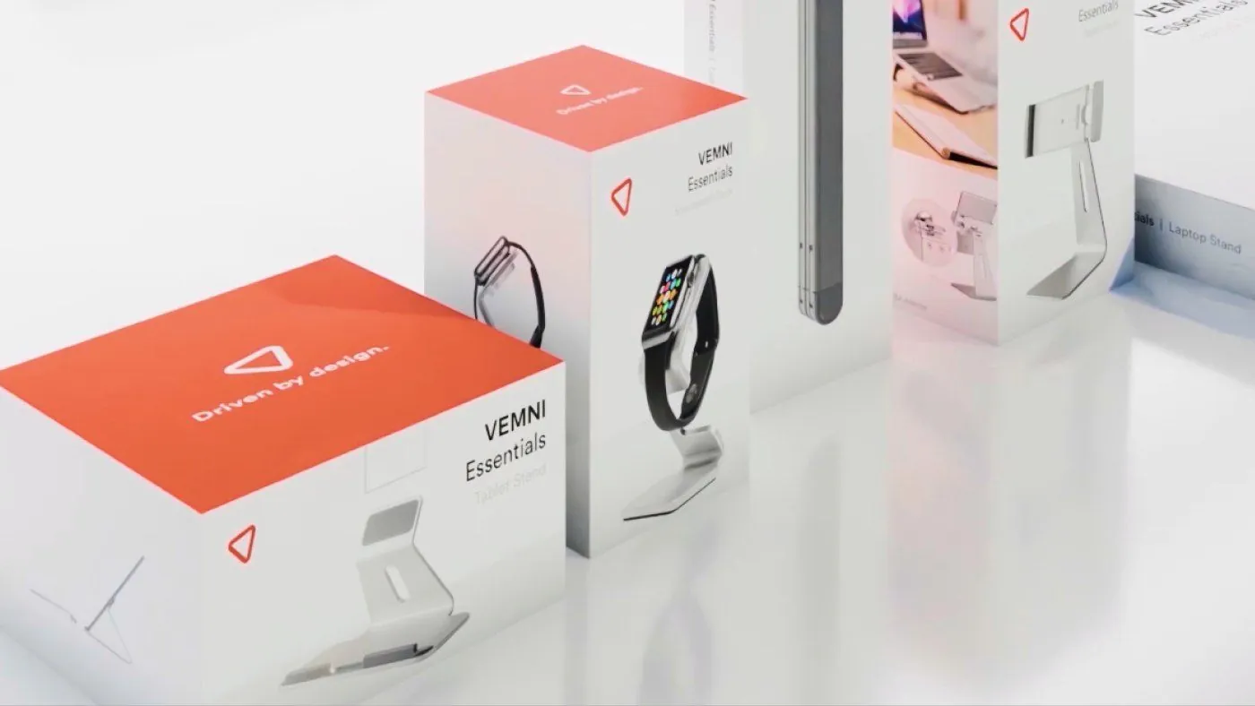
Designing product packaging starts not with pretty, but with brand, product and context
At first glance, designing product packaging often looks like an aesthetic choice. Which colour works well. Which style feels premium. Which front looks more modern than the competition’s. Yet strong packaging rarely starts with taste alone. It starts with the question of what a product needs to communicate, who it is for and in what context it is sold.
That difference matters. Packaging that looks great in a brainstorm is not automatically packaging that works well in a web shop, on a marketplace or in a product grid. It must not only evoke a brand feeling, but also explain what the product is, why someone should trust it and how it differs from other options. As soon as that layer is missing, what remains is mostly decoration.
That is exactly why designing product packaging is not a standalone exercise in form, but a translation between brand, product and channel. What exactly are you selling. How well known is your brand already. Which information must be clear immediately. Is the product mainly seen physically, or first online in thumbnails and packshots. Questions like these determine far more than just the stylistic direction.
At BrandMonks we therefore look at packaging as a commercial visual layer. Strong product packaging does more than protect or present neatly. It helps make your brand recognisable faster, makes the product easier to understand and makes sure the packaging also holds its own in e-commerce.
What good product packaging must do before it is allowed to look good
Good packaging does not need to be pretty first, but functionally strong first. That does not mean aesthetics are unimportant. It does mean that looks only add value once the packaging does its job. It must guide the first glance, build trust and set the right expectations about what someone is buying.
The first task is product understanding. A customer must quickly sense what type of product they are looking at. That sounds obvious, but this is exactly where it often goes wrong. The packaging then mainly wants to create atmosphere, while the basic question “what exactly is this” is answered too late or too weakly. Online in particular, that costs strength immediately.
The second task is brand recognition. Packaging can be subtle, but it must speak the same language as the brand. Colour, composition, typography and tone must not only be right on their own, but also be in line with how the brand appears elsewhere. Otherwise packaging feels like a separate object instead of part of a bigger whole. From that angle, branding is the logical companion.
The third task is helping people choose. In many categories, packaging must not only look good, but also help with comparison. Which product is this. Which variant is this. What position does it take within the range. That is where packaging starts working as a commercial tool instead of a decorative shell.
Only after that comes the question of how eye-catching, premium or bold the design can be. If the foundation is not right, extra style elements usually reinforce the wrong things. The packaging may then look richer, but not clearer. So good product packaging starts with function, and uses form to make that function faster and more attractive.
Which elements on product packaging really deserve priority
One of the hardest parts of designing product packaging is not thinking up everything that needs to go on it, but deciding what must be seen first. Many packs get stuck because brand, product type, variant, claims and supporting details all want attention at the same time. That does not make a front more informative, it makes it more restless.
For most products, a clear priority layer works best. First it must be visible which brand the product is from, or at least which brand world it belongs to. Then the product type must be understandable. Only after that does the variant or specific version get its own role. Claims, benefits, badges and detail information should support that structure, not drown it out.
This is exactly where this broad introductory page touches on packaging hierarchy. That is where we zoom in further on the order of brand, product and variant. What matters here is mainly that priority is the foundation of every good packaging design. As soon as you skip that order, visual competition arises between elements that should actually be working together.
That also applies to choosing what does not need to go on the front. Many teams want to solve too much information above the fold. Extra benefits, extra explanation, extra context, extra icons. But not everything needs to be decided at first glance. Good packaging gives enough direction quickly enough to make someone look further. It does not have to explain every detail at once.
So the question is less “which elements belong on product packaging” and more “which elements deserve priority”. That difference makes packaging calmer, sharper and more commercially useful.
How to link packaging to brand positioning
Packaging can be technically perfect and still fail to convince. That usually happens when the design language does not match the brand positioning. The packaging then feels either too luxurious for the product, too generic for the brand, or too busy for the target audience that actually expects clarity.
Brand positioning determines more than just colour preferences. It also determines tone. How bold can the packaging be. How much calm is credible. How much explanation is needed. How premium or functional should the front feel. A price-conscious product often calls for a different emphasis than a specialist niche product or a brand that leans heavily on experience.
That is why packaging design should always start with the brand role of the product. Do you mainly want to radiate trust. Do you want to claim a distinctive visual place instead. Do you want to make a technical solution understandable. Or must the packaging bridge the gap between a strong brand story and a product that would otherwise feel too interchangeable. For the more narrative layer, product packaging with a story is the logical companion.
A strong brand fit also means packaging does not stand apart from the rest of your brand expressions. A sleek, grown-up web shop with a messy packaging front feels incoherent. A premium brand with a cheap-looking unboxing leaks brand value at the very moment it should become tangible. That is why packaging must speak the same language as your photography, tone of voice, product pages and visual brand codes.
So if you link packaging to brand positioning, you are not just designing something that looks good on a mood board. You are building a front that feels credible within the whole brand.
How to design packaging for web shop and marketplace at the same time
For many brands, packaging has long stopped being only a physical object. It first has to work in a web shop, on a marketplace, in a thumbnail or in a product grid, and only then in someone’s hand. That fundamentally changes the design task. What still looks rich and refined on a desk or a print proof can become vague, busy or interchangeable online.
That is why you need to decide early on how packaging behaves on screen. Does the front still work at a small size. Is the product type still clear. Does the brand stay recognisable. Does the variant not disappear. Are colour blocks and contrasts strong enough not to fade between competing products. For that visibility angle, packaging that stands out in e-commerce is the logical companion.
The marketplace context makes this even sharper. There, packaging competes not only with other brands, but also with platform environments that leave little room for nuance. Small main images, fixed layouts and fast scrolling force packaging to communicate faster. A strong detail that only becomes visible at a large size achieves little there. The main line must be right first.
Product families also play a part. If several flavours, sizes or versions are visible together online, the line must stay recognisable without variants blurring into one another. Then packaging is no longer just about a single front, but also about system logic. From that broader range perspective, packaging for product variants is the logical companion.
That does not mean web shop and marketplace always ask for exactly the same thing. Your own web shop often offers more room for brand story and context. A marketplace usually calls for faster scannability. Strong packaging design therefore does not look for two separate solutions, but for a front that keeps enough recognition, product understanding and visual calm in both environments.
Get that right and you make packaging not only more attractive, but also much more useful across channels.
The difference between pretty and converting packaging
Pretty packaging is not the same as converting packaging. Pretty packaging is often judged on taste, style and originality. Converting packaging is judged on what it does: building recognition faster, speeding up product understanding, reducing doubt and setting the right expectation.
That does not mean pretty packaging is unimportant. It does mean aesthetics alone are not enough. A beautiful design that stays unclear in a thumbnail, makes a variant invisible or lets the product type land too late helps less commercially than slightly plainer packaging that is clear straight away.
Converting packaging translates form into function. It makes it easier to see what you get. It feels credible for the brand and the price point. It supports packshots, product pages and marketplace images instead of working against them. And once someone receives the product, that same logic carries through into improving the unboxing experience.
The comparison below makes that distinction more concrete.
| Element | Pretty approach | Stronger commercial approach | Effect on understanding or choice |
|---|---|---|---|
| Front | Artistic and atmospheric, but slow to read | Clear main layer for brand and product | Faster product understanding |
| Variant | Solved subtly and elegantly | Recognisable difference in a fixed place | Less confusion between versions |
| Claims | Lots of atmosphere, little direction | Only relevant claims, in a supporting role | More calm and better scannability |
| Channel fit | Designed as if packaging is only seen physically | Designed for packshot, grid and product page at once | Stronger e-commerce performance |
| Brand fit | A nice standalone style | Design language matches brand and price level | More trust and consistency |
Common mistakes when designing product packaging
The first mistake is designing too early. Teams then pick colours, styles and references before it is clear what the packaging has to do in practice. As a result, the outcome is steered more by taste than by function.
A second mistake is wanting to communicate too much at once. Logo, product name, variant, claim, atmosphere, quality mark and extra explanation all have to be visible. Then nothing gets real priority and the packaging becomes busier than necessary. In practice you then often see a front that tries very hard, but gives little direction.
A third mistake is channel blindness. The packaging is designed as if it is only seen physically, while for many customers the first point of contact is online. Later it turns out the packshot is too busy, the variant does not stand out or the product type is read too late. The result is a beautiful design that turns out commercially weaker than expected.
It is also common for brands to treat packaging as a separate project. The front is then suddenly expected to solve brand problems that were never clear in the first place. But packaging cannot repair unclear positioning. It can only reinforce it or make it visible. That is why the foundation beneath the design must already be clear.
Finally, things often go wrong as soon as a first pack is extended to more SKUs without a system. A beautiful one-off still works fine, but the line starts to wobble as soon as extra variants or channels are added.
How to go from a first direction to a scalable packaging line
A strong first pack is valuable, but only really interesting if it can be extended. Many brands lose that line as soon as the range grows. A new flavour, a different size or an extra product group comes along, and suddenly it turns out the first pack was mainly a standalone design rather than a scalable foundation.
That is why it helps to think early about ground rules instead of just form. Which parts always stay recognisable. Which elements may change. How does variant information become visible. How does the front stay readable online when several products sit side by side. Once those questions are answered early, packaging grows along more easily.
That does not have to mean everything is locked down tightly. It does mean new products do not have to keep reinventing how brand, product type and variant relate to each other. That naturally creates more coherence between individual designs and a stronger line between web shop, marketplace and delivery.
So if you design product packaging smartly, you are not just building a nice start, but a system that causes less friction later and stays scalable faster.
Frequently asked questions
Where do you start when designing product packaging?+
Do not start with style, but with context. What must the product communicate, who buys it, where is it seen first and what role does packaging play in brand recognition and product understanding.
Which elements belong on product packaging?+
That differs per category, but usually brand, product type and variant should form the main line. Claims, benefits and detail information should support that foundation and not drown it out.
What makes good product packaging?+
Good product packaging quickly makes clear what the product is, fits the brand, helps with recognition and also works in packshots, thumbnails and product pages.
How do you design packaging for a web shop and marketplace at the same time?+
By testing during the design whether brand, product type and variant stay readable at a small size. The main line must hold up in grids, thumbnails and main images, not just on a print proof.
What is the difference between pretty and converting packaging?+
Pretty packaging mainly scores on looks. Converting packaging also speeds up understanding, trust and choice. So it supports not only the brand experience, but also the sales context.
When should you bring in help for product packaging?+
As soon as packaging has to do more than look neat. For example if it has to support multiple channels, becomes part of brand positioning or has to scale across a larger range. Want to make that concrete for your own line? Book an intake call.
Conclusion
Designing product packaging does not start with taste, but with the role packaging has to play between brand, product and channel. Once that foundation is clear, design becomes much more focused. Packaging then helps not only to make something prettier, but also to build understanding, recognition and trust faster.
That is where the real value lies. Strong packaging works not just on a mock-up, but in thumbnails, product pages, marketplaces and later in the customer’s hand. Want to turn that step into packaging that works more strongly and consistently in commercial terms? We are happy to think along with you about product packaging.

Melle Sikma
Helmsman
melle@brandmonks.nl