A shopper on bol.com decides in a few seconds. The images do most of the work: they answer questions before anyone reads the description. Which images do you need, and in what order?
In short
- The main image has to be clear at a glance.
- Every image after that answers one question the shopper has.
- With templates you keep this consistent across your whole range.
First impressions count
A search results page shows dozens of products side by side. The main image decides whether someone clicks through. After that, the other images have to remove the doubt: does it fit, does it work, is it worth the price?
The types of images
- Main image: the product, sharp and clear.
- USPs with explanation: the three or four most important benefits.
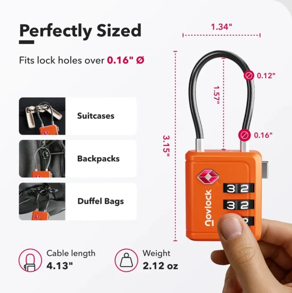
- Dimensions: so the shopper knows whether it fits.
- Product in use: what it looks like in real life.
- Comparison: why your product beats the alternative.
- Specifications and package contents: exactly what is in the box.
An example: Novlock
For Novlock we made listing sets for TSA padlocks: dimensions, TSA approval, strength and a comparison between 4 and 3 digits. Because everything comes from templates, each set is ready within minutes in 7 languages.
+93%conversion in 1 year
7languages per launch
3.5×faster launches
The right order
- Main image. What is it?
- Key benefit. Why this one?
- Dimensions. Does it fit?
- In use. How does it feel?
- Comparison or specifications. Why not another one?

Melle Sikma
Helmsman
melle@brandmonks.nl