Why Bol.com crops your images, and the new rules for 2026
You have the perfect product photo. Sharp, professional, completely ready. You upload it to Bol.com and… half of it gets cut off. Frustrating, isn’t it?
This is not a random move by the platform. Bol.com has a clear reason for this automatic cropping, and it has everything to do with uniformity and the customer experience. But it also means that you, as a seller, need to know the rules to stop your product looking mutilated. We dig into the ‘why’, set out the latest guidelines and give you practical tips to keep your images intact.
In this article
- Why does Bol.com cut away white space?
- The official guidelines for your main image
- What is strictly forbidden on your main image?
- The pixel trick: how to prevent cropping
- How to get perfect Bol.com images
Why does Bol.com cut away white space?
Let’s get straight to the point. Cropping your images is not a technical error or harassment. Bol.com does it with a clear goal in mind. There are three main reasons why the empty space around your product is rigorously removed.
First, there is the drive for a uniform display. Bol.com wants its platform to look like a neat, orderly white shelf in a physical shop. By automatically removing white space, it enforces a consistent look. Every product gets the same treatment, which gives the customer a much calmer and more professional picture. Your photo has to sit neatly among thousands of others.
It is also about pure efficiency. Less white space means a more compact image and therefore a smaller file. This means more products fit on a screen without endless scrolling. More importantly, it improves page loading time. A fast website matters a great deal for the user experience and is also valued by Google. It is all about removing unnecessary ‘noise’.
The most important reason, however, is focus. Without distracting empty areas, all attention goes straight to your product. The customer’s eye is immediately drawn to what matters: the details, the quality, the item itself. It is a deliberate choice to maximise visual appeal and increase the chance of a purchase. Good listing design starts with an image that gets straight to the heart of it.
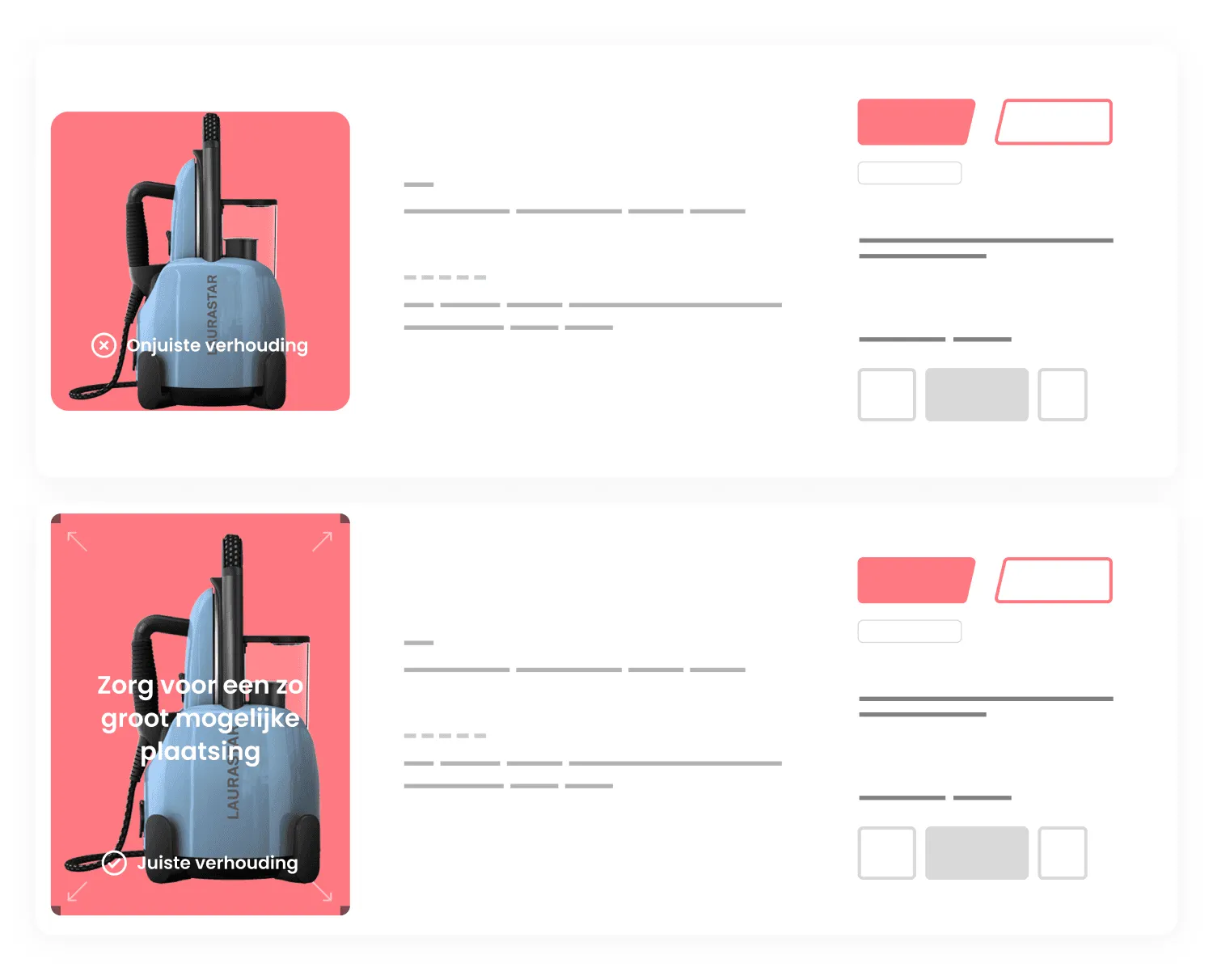
The official guidelines for your main image
Right, we now know why it happens. But how do you play the game smartly? By knowing the rules. Bol.com is very specific about this, and these rules are not optional. Let’s list the key requirements for the main image, the photo that makes or breaks your product.
These are the technical specifications you cannot get around:
- Dimensions: At least 1200 x 1200 pixels. This is a hard requirement to activate the zoom function that customers use to view details. Without zoom you miss out on sales. The maximum size is 6000 x 6000 pixels.
- File size: Between 30 KB and 10 MB. Try to keep the file size as small as possible without losing quality. Speed is everything.
- Background: Pure white (#FFFFFF). No cream, no light grey and absolutely no visible shadow of the product. The background has to be ‘invisible’.
- Product display: The entire product must be visible, photographed straight from the front and filling as much of the frame as possible. Save artistic angles for the lifestyle images, not for the main image.
- Packaging: The product must be out of its packaging, unless it is a board game, software or a media carrier. Customers want to see what they are actually getting, not the box it comes in.
These rules form the foundation. If you already go wrong here, there is a good chance your image will not perform as well as it could. Want to know how to create perfect product photos that meet all these requirements? That is a craft in itself.
What is strictly forbidden on your main image?
Besides the technical requirements, there is a blacklist of elements that Bol.com simply does not want to see on the first photo of your product. These rules exist to keep the ‘digital shop window’ clean and trustworthy. One misstep here and your image may be rejected or, worse still, your listing underperforms.
Make sure your main image is free of the following:
- Text, logos and watermarks: Your company logo, a brand logo (unless it is on the product itself) or a watermark are out of the question. The image must be purely about the product.
- Promotional slogans: Stickers or text such as “New!”, “Sale!” or “Limited-time offer” are forbidden. Service-related information such as “free delivery” does not belong here either. You put this information in the fields intended for it.
- People or models: The main image is for the product alone. Lifestyle images with models are a great addition as the second or third photo, but not as the first.
- Illustrations or drawings: It has to be a real, professional photo. A technical drawing or an icon is not allowed to represent the product.
- Frames and borders: Do not add graphic frames or borders around the image. The image must fill the entire space from edge to edge.
- Copyrighted material: Never use images from Google Images or other websites without permission. This can lead to serious claims. Only use imagery that you own the rights to.
The pixel trick: how to prevent cropping
OK, you follow all the rules to the letter. Your background is pure white and your product sits on it perfectly. Yet you notice that Bol.com’s algorithm is sometimes a little too aggressive and cuts off exactly that important edge of your product. What now? There is a smart, technical solution we often use to stay one step ahead of the system. We call it the pixel trick.
The idea is surprisingly simple. We add a few tiny, almost invisible pixels in the outermost corners of the image. These pixels are usually just one by one in size and have a colour that differs only slightly from the pure white background (think #FEFEFE instead of #FFFFFF). To the human eye, this difference is imperceptible.
Bol.com’s cropping algorithm, on the other hand, does detect these pixels. The system sees the image as ‘completely filled’ right into the furthest corners and concludes there is no white space to cut away. The result? The algorithm leaves your carefully built white space alone. This is a subtle intervention that makes sure the composition you had in mind is fully preserved. It creates a buffer zone that stops the system from taking over. That is how simple it can be to keep full control over your Bol.com listing .
How to get perfect Bol.com images
Taming Bol.com’s image requirements is not an impossible task. It comes down to understanding their ultimate goal: creating a uniform and pleasant shopping experience for the customer. By sticking closely to the technical specifications, with 1200×1200 pixels and the pure white background as the main pillars, and avoiding all forbidden elements, you are already well on your way.
If you still find that your images are being cropped when you do not want them to be, the pixel trick is an effective and professional solution. Can’t work it out yourself, short on time, or simply want to be sure your product listings are optimised from A to Z for maximum sales? Then it may be time to leave it to the experts. Get in touch , and together we will look at how to give your products the attention they deserve.

Melle Sikma
Helmsman
melle@brandmonks.nl