The hidden costs of poor UX: where users quietly drop off
It does not show up in your analytics and your customers never mention it, but you feel it in your revenue. Poor UX creeps in, and it costs you conversions.
UX mistakes are rarely dramatic. No blank pages, no error messages. But they cost you visitors. And so revenue. Precisely because it is subtle: an awkward flow, unclear buttons, a search function that almost works. In this blog we show where poor UX hides, how to spot it and what it really costs you if you leave it alone.
Contents
- UX is not a design problem, it is a revenue problem
- Friction, confusion and missed expectations
- Where UX often goes wrong (and nobody notices)
- From frustration to flow: how to tackle it
- Conclusion
UX is not a design problem, it is a revenue problem
UX is often seen as something visual. Nice design, clear buttons, a responsive layout. But that is not where the problem lies. Poor UX is in how people move through your site, how quickly they find what they are looking for, and whether they stay or drop off.
And if that does not run smoothly, there are direct consequences. No conversion, less trust, more pressure on support. Your visitor may not leave because of an error. They quietly disappear without buying anything. And you see very little of that in Google Analytics.
You only spot UX mistakes when you look closely. When you watch sessions. Or when you dig through heatmaps. Only then do you see how people click, scroll back, hesitate or drop off. And then you understand that UX is not about form, but about behaviour.
Friction, confusion and missed expectations
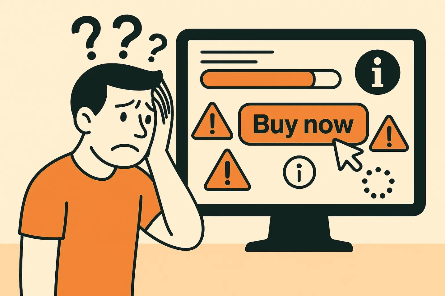
The biggest UX problems are rarely technical. They are in the gap between expectation and experience. Your visitor arrives with a goal, and every second of delay or noise pushes them away from it.
Examples? Think of filter options that are unclear. Text links that look like buttons. Or a form that asks for three fields too many. Nobody calls you about it. But they do click away.
You feel poor UX in behaviour: – Lots of repeated clicks on the same element – Scrolling up, back down again, and then nothing – Forms that are half filled in and then abandoned – Product pages where nobody clicks a CTA
You only see all these patterns when you analyse behaviour. Not in reports, but in tools like Clarity, Hotjar or session recordings. That is where you see where things get stuck. And what it costs you in revenue.
Where UX often goes wrong (and nobody notices)
UX mistakes often arise during growth. New features, more devices, different teams. Something that once made sense no longer works. And it often goes untested. Because technically it still functions.
Common pitfalls:
- Mobile elements that fall outside the thumb zone
- Tap targets that are too small on busy product pages
- Shopping baskets that do not remember what you added earlier
- Forms with unclear validation or error messages
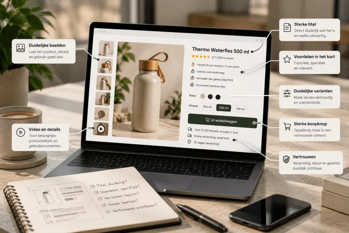
- Confusion about delivery times, returns or shipping costs
They are not bugs. But they do hurt your conversion. Because they cause irritation. Because people do not dare to order. Or simply because it takes too much effort.
From frustration to flow: how to tackle it
Improving UX starts with looking. Not at your pixels, but at your users. Use behaviour tools. Analyse where visitors drop off. Look at rage clicks, scroll loops and exits at key points. And above all: test it yourself. On mobile, with a poor connection, in a different browser.
Then work on flow. Remove friction. Make forms shorter. Make sure important information is visible straight away. And test that with real users, not just with colleagues.
Want to work on that visually? See how we use UI/UX for behaviour-driven design.
And make UX part of your CRO strategy. Because if people drop off before they reach your CTA, it does not matter how good your button is.
Conclusion
Poor UX costs you customers without you noticing. They are not visible errors, but invisible hurdles. If you want to do something about it, start by looking at where the behaviour stops. And do not just optimise for clicks, optimise for a complete user experience.
Want to know more? Let us analyse your web shop with a fresh UX eye, or take a look at our approach to conversion optimisation. Sometimes your biggest win is in what your visitor never tells you.

Melle Sikma
Helmsman
melle@brandmonks.nl