Why returns often start before the order is placed
Reducing returns in your web shop usually does not start with the returns label, but with the expectation your product page creates before the purchase.
The better a customer understands up front what they are buying, the smaller the chance that the product disappoints after delivery and comes back.
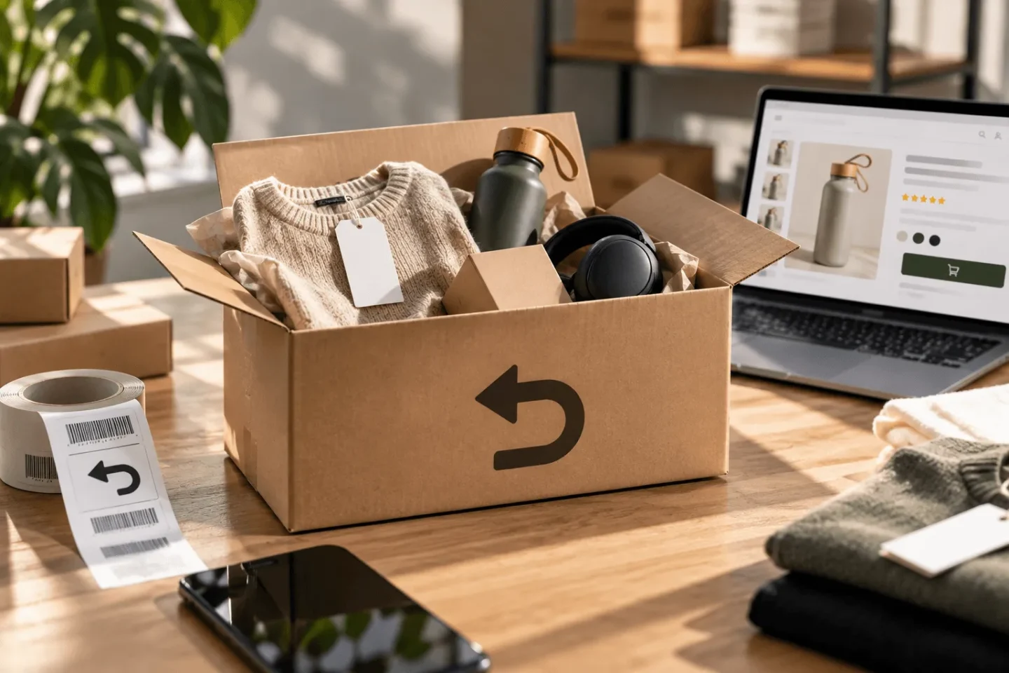
At first glance, many returns look like a logistics problem. A parcel comes back, the product needs checking, stock is adjusted and the customer gets their money back. But the cause often lies earlier in the customer journey. Someone thought the colour would be different, that the product was bigger, that the fabric would feel different, that the size would fit better or that something was included that was not supplied.
That makes reducing returns relevant for e-commerce content. You do not prevent wrong purchases only with a returns policy, but above all with better expectations before the purchase. Product information, product photos, detail shots, size information, variant presentation and clear service information together determine how realistic the customer’s picture is.
At BrandMonks we therefore look at returns as a content and visuals question. Not because every return can be prevented completely, but because many unnecessary returns are caused by a lack of clarity. A better product page helps customers choose with more confidence and lowers the chance that reality differs from the picture they formed online.
The pressure of returns makes better product content more important
Returns are not only annoying for the customer. They eat into margin, cost time, burden customer service and lead to extra transport and packaging. The Consumentenbond states that in the Netherlands roughly one in nine online orders is returned. In categories such as fashion, that share can be much higher.
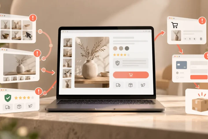
That figure makes clear why this topic is not only operational. Every wrong expectation on the product page can come back later as a return. And the larger your range becomes, the faster small ambiguities add up. One product with unclear sizing is annoying. A whole product line with inconsistent images, incomplete specifications or unclear variants becomes a structural problem.
Return rates for online purchases
Indicative percentage of returns. The actual return rate varies by category, product type and customer expectation.
Clear product information prevents wrong expectations
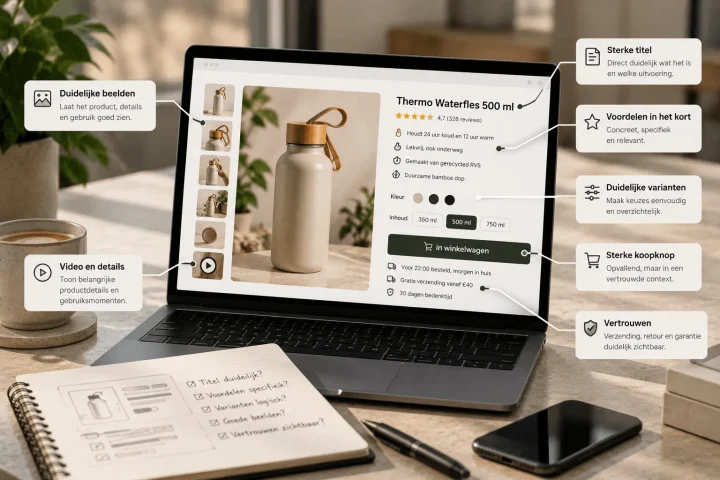
Product information has to do more than list features. It has to help the customer judge whether the product suits their situation. That calls for concrete, complete and honest information. Dimensions, material, contents, compatibility, care, fit, packaging and use case can all prevent returns when they are clear in time.
Many product pages do contain information, but not always the information a customer needs to avoid a wrong purchase. Specifications are placed too low, product copy stays too general or important details are hidden in images. That leaves room for interpretation. And interpretation is exactly where returns often begin.
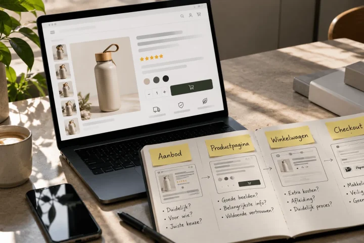
A good e-commerce product page structure helps you place that information logically. At the top it should be clear what the product is and why it is relevant. Then come the details: size, material, contents, use and terms. The less the customer has to guess, the smaller the chance of disappointment after delivery.
Product photos have to be attractive and honest
Product photos have a huge influence on expectations. An image can communicate colour, scale, material and finish faster than text. But that is exactly why images can also cause returns when they promise too much or show too little. A colour that looks warmer online than in reality, a product without a scale reference or an overly flattering angle can disappoint later.
Reducing returns with product photos does not mean images have to become less beautiful. It means they have to become more realistic and more informative. Good images show the product sharply, consistently and recognisably. They show details that matter for the purchase decision. They give context where needed: how big is the product, how does it fit, what does the material look like, exactly what is in the box.
That is why fixed image roles work well. A main image for recognition. Detail shots for material and finish. Context images for scale and use. Where needed, explanatory visuals for contents, features or differences between variants. Product images for more conversion ties in directly with that image logic.
Colour-sensitive products need extra care. Neutral light, consistent post-processing and clear colour names help prevent a customer from expecting something other than what they receive. A perfect colour guarantee does not exist online, but you can make the gap between image and reality much smaller.
Size, scale and fit have to become visible
Many returns happen because customers misjudge the size or scale. That applies to clothing and shoes, but also to home accessories, bags, packaging, electronics, toys and products where centimetres stay abstract online. A number in the specifications is useful, but not always enough.
That is why size has to be made visible and understandable. Think of a model with their height and the size they are wearing, a product next to a familiar object, a close-up of the fit, a size guide that is not too complicated or a visual that shows dimensions directly on the product. That way the customer has to do less translating themselves.
Variants can also cause returns. If colour, size, contents or version do not change along with the image and copy, someone is more likely to order the wrong option. Clear variant presentation on the product page helps customers choose without guessing.
For larger product lines, this can be made scalable. You do not have to rethink how to show size or scale for every product. You can create fixed formats per product type. That makes the product pages more consistent and prevents some products from getting enough guidance while others do not.
Use return reasons as input for better product pages
Returns data is valuable when you use it not only to process returns, but also to improve product pages. The reasons “runs small”, “colour differs”, “expected a different material” or “does not fit device” tell you exactly where the product information falls short. That feedback should come back into your content.
Many web shops collect return reasons, but do not translate them into improvements in a structured way. So the same problem keeps coming back. If customers keep reporting that a product looks bigger in the photo, an extra scale image makes more sense than just a customer service reply. If a variant is often chosen wrongly, the variant choice needs to be clearer. If colour differences keep coming up, the image set or colour information needs to be sharper.
This is also where conversion optimisation and reducing returns meet. You improve not only the chance of a purchase, but also the chance that the purchase is right. A product page that sells more honestly and completely may lead to fewer impulse purchases that come back later, but to more orders that fit.
A returns policy helps, but does not fix wrong expectations
A clear returns policy is important. Customers want to know how returning works, who pays the costs and which deadline applies. A lack of clarity there damages trust. Still, a returns policy is not the first solution for unnecessary returns. It mainly governs what happens after the purchase has disappointed.
Return costs can also influence behaviour, but they do not replace good product content. If customers send products back because the information up front was wrong or incomplete, a returns barrier feels more like frustration than a solution. So start with expectation: show more clearly what someone is buying, who the product suits and when it is less suitable.
That does not mean you have to highlight every negative aspect. It does mean you communicate realistically. A product that runs small can simply say so. A material that scratches easily should not only be presented as luxurious. A colour that can vary per screen calls for several honest images and a clear name.
Fewer returns calls for consistent content across your range
Improving a single product page is useful, but with a larger range you mainly need consistency. Returns often happen because product pages are built unevenly. One product has lots of details, another hardly any. One variant has good images, another only a packshot. One category shows scale clearly, another does not.
That is why a template approach works well. Not as a rigid format in which every product sounds the same, but as a fixed basis for product information and image roles. Which details are mandatory. Which images belong to this product type. Where the size or scale information goes. How variants are shown. Which return reasons should be checked as standard before new products go live.
For BrandMonks, this is exactly the link between visual content and scalable execution. We can not only make product pages stronger, but also develop formats that let you fill new products faster and more consistently. Think of fixed image sets, copy blocks, specification formats and Figma components for product ranges.
What BrandMonks can improve in practice
BrandMonks mainly helps on the layer where expectations are formed: the visible product content. That starts with product images and product page structure. Which photo is still missing. Which detail question remains unanswered. Which USP is too general. Where important information appears too late. Which variant choice causes doubt.
Then we translate those insights into execution. For some web shops that means extra detail or size images, made with 3D, AI or by editing existing images. For other web shops it means a better product page structure, sharper copy or a template that builds product families in the same way. For larger ranges, this way of working can help process return-sensitive information faster and at scale.
The point is not that every return disappears. That would be unrealistic. The point is that customers less often receive something that feels different from what they expected. That improves not only margin and operations, but also customer satisfaction and trust in your brand.
Frequently asked questions about reducing returns in your web shop
How can you reduce returns in a web shop?+
Start with the causes of returns. If customers send products back because of the wrong size, colour, material or expectation, first improve product information, product photos, size advice, scale images and variant presentation.
Do better product photos help against returns?+
Yes, especially when photos become more realistic and more informative. Show colour, scale, material, details, use and the contents of the package as clearly as possible. Images have to sell, but also set the right expectation.
What do you do with return reasons?+
Use return reasons as input for product pages. If a reason comes up often, adjust the content. For example, add extra size advice, detail photos, colour information or compatibility information.
Should you charge return costs to reduce returns?+
Return costs can influence behaviour, but they are no substitute for good product information. First make sure customers can judge properly up front what they are buying. Then you can look at your returns policy and return costs strategically.
Conclusion: fewer returns starts with better expectations
Reducing returns in your web shop starts with a simple question: does the picture the customer gets before buying match what they will soon hold in their hands? If that picture is too vague, too flattering or too incomplete, wrong purchases happen. And wrong purchases become returns.
The biggest gains are therefore often in product content. Clear information, realistic product photos, good communication of size and scale, clear variants and actively using return reasons make the purchase more reliable. Not by selling less attractively, but by selling more honestly and concretely.
For BrandMonks, that is exactly where e-commerce content adds value. Strong visuals and copy lead not only to more conversion, but also to better expectations. And when you capture that approach in scalable templates, you stop the same return-sensitive mistakes from appearing again and again with new products.

Melle Sikma
Helmsman
melle@brandmonks.nl