Product page structure in e-commerce: why order matters more than more content
A product page sells better when a visitor immediately understands what they are looking at, why it is relevant and what the next step is.
The best product pages do not necessarily say more, but put information in the right order so doubt disappears faster.
Many e-commerce teams try to make product pages stronger by adding something every time. Another USP block, another badge, another strip of reviews, another extra piece of text, another visual element. On paper that seems logical, but in practice it often makes a page heavier rather than more convincing. A visitor does not want to see a collection of separate optimisations. They want to move smoothly through a decision route.
That is why product page structure in e-commerce is not a stand-alone ui/ux design detail, but a conversion question. If the order is off, even good content feels unclear. Then proof comes too early, depth sits in the wrong place or important choice support comes too late. The result is that visitors do get information, but not at the moment they need it.
That is why at BrandMonks we do not only look at which blocks are on a product page, but above all at when they appear. In this guide we show you how to build a product page logically, what belongs above the fold, where to place specifications and reviews and how to make visuals and text fit together well without the page feeling messy.
Why many product pages feel unclear
Many product pages are not weak because there is too little information on them, but because the information has no clear hierarchy. Everything tries to be important at the same time. The title wants to sell, the image wants to set a mood, the USPs want to convince, the reviews want to give trust and the specifications want to be complete. Each block has its own reason to be there, but together the page feels like a pile of signals rather than one logical story.
That difference is key. A visitor does not come to a product page to study everything. First they want to understand quickly whether they are in the right place. Only after that is there room for comparison, detail and confirmation. As soon as a page breaks that order, the visitor has to decide for themselves what to read first and what becomes relevant later. That takes energy, and on product pages extra thinking is almost always a brake on conversion.
Restlessness also arises when blocks overlap in content. A benefit already sits next to the price, comes back in the product description, then appears again in a USP bar and is repeated once more in a visual. Then the page is not more informative, but more repetitive. Good structure is therefore not only about what you add, but also about what you do not need to say three times.
The basic structure of a product page from top to bottom
A strong product page usually has three layers. First comes the orientation layer: the visitor must see straight away what the product is, what it costs, which version they are viewing and why this product is interesting. Then follows the depth layer: here you give extra explanation, additional images, specifications, applications and nuance. Only after that comes the confirmation layer, where reviews, extensive trust signals, guarantees, FAQ or extra buying arguments remove the last doubt.
That three-way split sounds simple, but in practice it is a useful filter for almost every block on the page. An element someone needs to quickly place what they are seeing belongs early. An element that mainly supports comparison or depth can come later. And a block that mainly reassures or removes the last hesitation usually works better once the basics are clear.
This does not mean every product page needs exactly the same wireframe. A product with lots of variants calls for a different emphasis than a simple accessory. A technical product often needs specifications earlier than a lifestyle product. Still, the underlying logic stays the same: first understanding, then depth, then confirmation.
For teams with a broader range that is even more important. As soon as you define this structure not just for one page, but for a whole product group, optimising becomes much more consistent. That also creates a natural bridge to creating product page templates, because fixed blocks only really add value once their place and function are clear.
What must be clear straight away above the fold
The top part of the product page must above all answer the first decision questions quickly. What exactly is this. Who is it meant for. Which version or variant am I looking at now. What does it cost. And what do I do if I want to buy. If that basis is not clear within a few seconds, the rest of the page is already repairing what went wrong earlier.
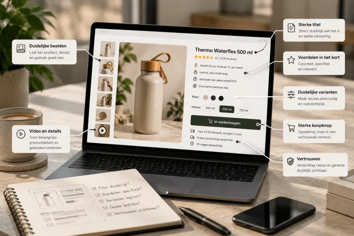
That is why above the fold you need at least a clear product title, an informative main image, price, availability or delivery time, a visible CTA and a compact summary of the main benefits. For products with choice elements such as colour, size or contents, the variant choice also belongs early in view. Not hidden lower down the page, but at the moment a visitor needs to be able to tell whether they are looking at the right version. For that choice support, variant presentation on the product page is a logical companion.
Above the fold is not the place to prove everything. It is the place to give direction. A visitor does not yet need to read a complete product specification or take in twenty reviews here. Above all they need to feel that this product is relevant enough to keep looking. That calls for sharpness rather than completeness.
A common mistake is giving this area too many extra signals. Quality marks, countdown timers, discount labels, shipping banners, returns notices, scarcity badges and cross-sell elements then all try to claim their own attention. The result is that the core fades into the background. Above the fold in particular, less often works better, as long as what is there answers the right questions straight away.
What should happen below the product title and CTA
After the first orientation comes the layer that helps the visitor a little further towards certainty. That does not automatically mean a long product description. Much more often it is about well-chosen depth blocks directly around or just below the buying section. Think of a short benefit summary, an explanation that clarifies an important difference, microcopy about delivery or returns and a first form of reassurance.
This part of the page should not explain again what the product is, but show why this product is a logical choice. That makes the content here more concrete. If the core promise sits above the fold, here you translate it into clear benefits, relevant nuance and first proof. Especially for products where functionality, size or application matter, this is the point where the page shows that it understands the customer’s doubt.
The area around the CTA also deserves attention here. A button does not convert better on its own because it is brighter, but because the context around it is right. Delivery information, clarity about returns, availability and short reassurance can make the step to adding to the basket easier, as long as they stay supportive and do not take over the whole top section.
Where to place specifications, reviews and proof
Specifications usually do not belong at the top of the page, but also not so far down that a visitor only finds them after the decision should really have been made. In practice specifications work best in the depth layer: after the visitor has recognised the product, but before they drop off for good over practical uncertainty. Think of dimensions, material, compatibility, contents, technical features or maintenance information.
Reviews and ratings work differently again. A compact review score or a small piece of social proof high on the page can help build trust early. But extensive reviews, experiences or use cases often work better lower down, when the visitor is already engaged with the content and is looking for more confirmation. That way you prevent proof from taking attention away from basic understanding too early.
The same principle applies to trust signals such as guarantees, delivery time, returns policy and quality marks. These elements are strongest when they are visible at the moment they resolve a relevant doubt. Around the CTA, a short reassurance about delivery or returns can do a lot. Lower on the page, a more extensive block of proof can make sense. So the best placement depends less on fixed dogmas and more on the question: which concern is still alive here. For that trust layer itself we go into more depth on social proof on the product page.
For broad conversion optimisation across the whole page, increasing product page conversion is a logical companion. This structure page focuses mainly on the order and placement of those elements, not on every individual CRO mechanism.
How to combine visuals and text without noise
A product page becomes stronger when text and image each have their own task. Problems arise mainly when they try to do the same thing. Then a visual says something that the paragraph below immediately repeats, or a USP bar names exactly what is already clearly visible in the image next to it. That does not feel like extra persuasion, but like explaining twice.
The strongest combination usually arises when the image answers quick questions and the text adds nuance. An image shows shape, scale or application, for example, while the text explains why that is relevant in practice. A detail shot makes material or finish tangible, while a short explanation translates the benefit into concrete terms. That creates collaboration instead of overlap.
This matters especially for product page structure, because images do not just belong anywhere between the text. They have to take part in the logic of the page. An image high on the page helps orientation. An image later on the page helps depth or proof. If you mix up those functions, the structure becomes less clear. For the image side we go into more depth on product images for more conversion. For the exact interplay between copy and visuals, the balance between text and visuals on product pages is also a logical companion.
How to make a product page faster to scan and clearer
Scannability does not only come from shorter text, but above all from a better rhythm. A visitor must be able to see at a glance where they are, which role each block has and where to find extra detail if needed. That means clear separation between blocks, logical subheadings, compact paragraphs, a predictable order and enough visual breathing space between different kinds of information.
A page becomes clearer as soon as similar information is grouped. Benefits belong with benefits. Specifications with specifications. Proof with proof. As soon as you spread one topic over four separate blocks, it seems as if there is more on the page than there really is. Structure is therefore also a way to lower the perceived busyness without cutting content.
Scannability also means the first layer of each block must be understandable straight away. A visitor should not have to read a whole paragraph first to discover that the block is actually about delivery, material or compatibility. The faster a block reveals its function, the easier the page reads on both desktop and mobile.
When a product page gets too busy
A product page is too busy as soon as several blocks ask for the same attention at once and the visitor no longer naturally senses what comes first. That can be caused by too many visual accents, but just as much by too many different kinds of information in the same part of the screen. So a page can also be too busy in its text, even when the design looks calm at first sight.
You often see this in small pile-ups. A discount label, a stock notice, a sticky element, three badges, a row of USPs, review stars, a free shipping line and an eye-catching CTA all try to be important at the same time. On their own they are logical additions. Together they make the main decision less clear.
A useful check is therefore: what does the visitor need to understand here first. If you cannot answer that question in one sentence, the block or part of the screen is probably too full. Improving structure then does not just mean adding, but also prioritising, merging and sometimes cutting.
Comparison: messy layout versus a logical product page layout
The comparison below shows why two product pages with roughly the same content can still perform very differently.
| Block | Placed too early or messily | Logical place | Effect on understanding and conversion |
|---|---|---|---|
| Product title and main image | Between too many badges, claims and extra blocks | Right at the top as first orientation | Visitor understands faster what they are looking at |
| USPs and key benefits | Spread over several places with repetition | Compact around the buying section | More direction without information overload |
| Specifications | Right at the bottom or actually above the fold | In the depth layer after first understanding | Less practical doubt at the right moment |
| Reviews and proof | Dominant straight away in the opening or hidden away | Short high up, extensive lower on the page | Faster trust without pushing out the core |
| Visuals and text | Same story told twice | Clear division of tasks per block | More calm and better understanding |
| CTA area | Loose button without context or between too many signals | In a clear buying block with targeted reassurance | Less friction towards the basket |
Frequently asked questions about product page structure in e-commerce
What should be above the fold on a product page?+
At least a clear product title, a strong main image, price, availability or delivery time, a visible CTA and a compact summary of the main benefits. For products with variants, the choice support also belongs early in view.
Where do you place specifications on a product page?+
Specifications usually work best in the depth layer of the page. Not as the opening block, but also not so low that a visitor first has to search needlessly for practical details such as dimensions, material or compatibility.
Where do you place reviews on a product page?+
A short review score or first form of social proof can help high on the page. Extensive reviews, experiences or more proof usually work better lower on the page, when the visitor is already more engaged with the content.
How do you combine visuals and text on a product page?+
By giving them different tasks. The image helps people recognise and understand quickly, the text adds nuance, explanation and context. As soon as both try to say exactly the same thing, you get noise.
When is a product page too busy?+
When too many blocks demand attention at the same time and it is no longer clear what should be read or looked at first. You often see this with a pile-up of badges, claims, visuals, reviews and CTA elements without a clear priority.
Conclusion: a good product page feels like a logical decision route
A strong product page structure in e-commerce is not about as many elements as possible, but about an order that makes sense. First the visitor must be able to place quickly what they are seeing. Then they want relevant depth. Only after that do they look for more extensive confirmation and proof. As soon as that route is clear, a product page feels lighter, more convincing and easier to use.
That is exactly where the biggest gain lies for many brands. Not in yet another separate optimisation block, but in a page that works better as a whole. When the structure is right, copy, visuals, proof and CTA automatically gain more power. And that makes product page optimisation not only more effective for one SKU, but also easier to scale across a whole range.

Melle Sikma
Helmsman
melle@brandmonks.nl