Creating product page templates: why scale without a system soon gets messy
Creating product page templates is not just about working faster, it is mainly about keeping the same quality while your range grows.
A strong template speeds up the production of product pages without images, structure, benefits and proof having to be reinvented for every new page.
As long as a brand only has a few product pages, custom work often still feels manageable. But as soon as product ranges get bigger, variants increase and different teams work on pages at the same time, small deviations soon appear. One page puts the benefits above the fold, another only halfway down. One product group has clear image roles, another does not. On one page the reviews sit in a logical place, on another they are a loose block at the bottom. Differences like these seem small, but they add up to a system problem.
That is exactly why creating product page templates is not about a downloadable template file, but about repeatable logic. Which blocks are fixed? Which parts are allowed to change? Where is there room for nuance? And how do you make sure new pages can go live faster without giving up clarity or persuasive power? In a broader sense, that belongs to the same question of scale as increasing product page conversion: a product page should not only convert, it should also be possible to produce it consistently.
For BrandMonks, that is exactly where the practical gain lies. Teams that work with templates do not just save time. They also get more grip on quality, brand consistency and roll-out across product ranges. In this guide we therefore show what a product page template solves, what you put in it, how you keep it flexible and when you deliberately depart from the standard.
What a product page template solves and why separate pages struggle to stay consistent
At its core, a product page template solves three things: repetition, alignment and differences in quality. Without a template, every team member has to decide again and again which blocks are needed, in which order they come and how much space each part gets. As a result, variation in structure, tone, use of images and proof appears almost automatically.
You see this especially when product pages grow over time. A first version often still starts logically. Then an extra USP block is added, an extra gallery image, a badge, a service bar, an accordion for specifications and perhaps a separate review module. Each addition seems defensible on its own. Together they make the page busier and harder to manage. What is missing then is not creativity, but a system that guards what the fixed basis of the page is.
A good template prevents every page from being treated as a separate project again. That does not mean every product page has to look identical. It does mean that the same types of decisions are not reopened every time. Which blocks should always return? Which elements belong above the fold? Which information is explored in more depth further down the page? For that underlying block logic, e-commerce product page structure is the logical next read.
For e-commerce teams that difference is big. Without a template you mainly optimise individual pages. With a template you think in product page systems. Improvement then is not just something that works on a bestseller, but something you can roll out in a controlled way across entire product groups.
What you put in a product page template and what you leave out
The mistake many teams make is confusing a template with a fully filled-in page. But a strong template does not fix every detail. Above all, it fixes the decision structure. Think of the core blocks, their function, their order and the space where product-specific content should land.
What usually does belong in a product page template:
- the main structure of the page
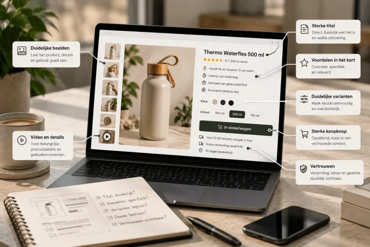
- fixed blocks such as title, price zone, main image, variant choice, benefit layer, specifications, proof and CTA logic
- component rules for things like tabs, accordions, badges, galleries and review modules
- content guidelines per block: short, in-depth, visual, proof-focused or technical
- exception rules for product groups with different information needs
What should not be completely nailed down:
- the exact amount of copy per product
- every visual detail of every block
- product-specific forms of proof
- variation in images or content that is needed to make a product truly understandable
That is the difference between a usable template and a rigid mould. A template should give direction, not write everything down. As soon as a team feels that every product is being pressed into exactly the same mould, the template has become too tight. But if almost nothing is fixed, you also lose the advantage of scale. The right middle ground is a fixed core with clear room to move per block.
Working with fixed blocks and modular components on product pages
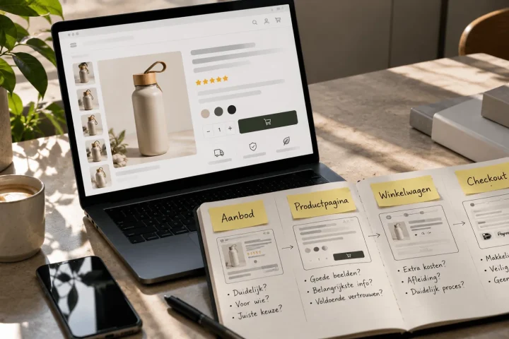
In practice, a product page template works best when it is built from fixed blocks and modular components. Fixed blocks determine the structure of the page. Modular components make it possible to vary within that structure without losing the logic.
A fixed block could be, for example: above the fold with title, price, main image, variant choice and first benefits. A modular component within it could be: a compact row of USPs, a short delivery line, a badge zone or a specifications accordion. The block stays the same in function, but the component can be filled in differently per product group.
That is exactly why product page templates are so much stronger than simple layout copies. They describe not only what the page looks like, but also what each part has to do. A component then has not just a visual style, but also a task. Is this component meant to compare, clarify, reassure or go deeper? As soon as that function is clear, teams can choose faster which component is or is not relevant for a certain product group.
For larger ranges that is indispensable. You do not want one generic product detail page template that has to solve everything, but a system of reusable building blocks. That way you keep an overview in Figma, in content production and ultimately in the live product pages too.
How to keep templates flexible per product group, variant and SKU
The real quality of a product page template only shows when you roll it out across several product groups. You then soon notice whether the system leaves room for difference. A home product, a technical accessory and a personal care product do not call for exactly the same emphasis. Yet you also do not want every group to become its own mini universe.
Flexibility therefore starts with naming what is allowed to vary per product group. Sometimes that is the kind of first benefit. Sometimes the number of detail blocks. Sometimes the amount of specifications or the role of comparison tables. The template stays the same in layout, but the priority within the blocks shifts.
With variants and multiple SKUs this becomes even more important. A template has to leave room for colour choice, size selection, bundle options or versions without the page becoming unclear. Which components change along with the selection should therefore be recorded in the template system. Think of image switching, price difference, delivery status or a short explanation of the variation. For that choice support on the live page, variant presentation on the product page is the logical next read.
This is exactly where a rigid template gets stuck. If every difference feels like an exception, you do not have a scalable system but a template that constantly needs repairing. A good template accepts that product groups and SKU structures differ, but keeps the way you deal with them consistent.
When to depart from a product page template
Departing from a template is not a mistake by definition. It only becomes a problem when teams depart from it without a clear reason. A template then slowly turns into a suggestion instead of a system. That is why a usable product page template should not only record what the standard is, but also when you deliberately depart from it.
Typical reasons to depart from it are:
- a product with an exceptionally high need for explanation
- a product group with a different logic of proof
- a range where comparison matters more than atmosphere or storytelling
- an introduction page for a new product line that temporarily needs more context
What matters is that a departure never completely undermines the core structure. If an extra block is needed, it should be clear what task that block has and why the standard is not enough here. That way custom work remains a regulated choice instead of a reflex.
How to standardise image, USP and trust blocks without becoming generic
Many product page templates do not fail on layout, but on content. They do set out fixed blocks, but they do not make clear how images, benefits and proof should connect per block. The result is product pages that look neatly consistent but stay flat in content.
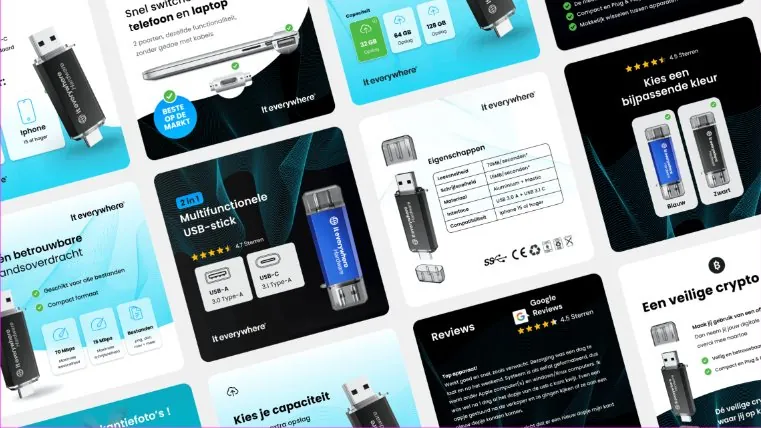
A better approach is to standardise not only the blocks, but also their role. For images, that means for example recording per product group which images are always needed: hero, detail, context, comparison or explanatory visual. For that image logic, product images for more conversion is the logical next read. The template then does not need to know every image yet, but it does know the fixed image roles.
The same goes for benefit blocks. Not every product has exactly the same USPs, but the template can record how many key benefits become visible early, how briefly they are worded and when more depth follows further down the page. For that benefit layer, showing USPs on the product page is the logical next read. You then do not standardise the words themselves, but the way benefits work on the page.
Exactly the same principle applies to proof and trust blocks. A template should not dictate that every product gets exactly the same review block or the same guarantee copy. But it should be clear where proof belongs, which forms of reassurance make sense high or low on the page and how many trust signals a page can handle without becoming cluttered. For that logic, social proof on the product page is the logical next read.
That is how you get standardisation without interchangeability. The template guards the function of each block, while the product still keeps its own content and nuance.
How to make product page templates workable in Figma or a design system
For many teams, a product page template only becomes truly usable when it also lives as a working tool in Figma or a design system. Not because Figma itself is the answer, but because a template without a shared component language soon fragments in practice. One person then works from old frames, another from loose variants, and someone else builds their own version anyway.
A workable system in Figma therefore does not start with one big screen, but with components, block variants and clear rules of use. Which blocks are mandatory? Which component variants exist? Which combinations are allowed? When do you use a long versus a short benefit module? Which proof component belongs to which purchase risk? Once that is properly recorded, a product page template also becomes transferable between design, content and development.
At BrandMonks this is in practice often as much a UI/UX design question as a content question. A template should not only look good in Figma, it should actually help you design and work out consistent pages faster. That is why a design system only really works when visual components are linked to content rules. Otherwise you get a neat library that still gives no direction.
Template versus custom product page: when to choose which
The choice between template and custom work is often made too black and white. As if templates are always limiting and custom work always performs better. In practice, the better question is: which part of the page deserves fixed logic, and which part calls for extra product-specific attention?
A template works best when you:
- have several comparable product groups
- want to roll out a lot of product pages quickly
- find consistency important for brand and operation
- know which blocks structurally contribute to understanding and conversion
More custom work makes sense when:
- a product needs an exceptional amount of explanation
- the buying logic differs fundamentally from the rest
- proof, visualisation or comparison calls for a different set-up
The smartest approach usually lies between the two. Not completely free custom pages for everything, but not a rigid template that flattens every product either. Anyone who takes creating product page templates seriously therefore does not build a straitjacket, but a controlled bandwidth.
Comparison: rigid template thinking versus scalable product page templates
The difference below shows clearly why some template approaches deliver speed, while others mainly introduce new limitations.
| Element | Rigid template | Flexible template | Why this scales better |
|---|---|---|---|
| Structure | Every product group gets exactly the same layout without nuance | Fixed core structure with room for product-specific emphasis | Consistency holds without pushing aside relevant differences |
| Components | Loose blocks without clear rules of use | Modular components with a fixed function and variants | Teams can choose faster without designing again |
| Image logic | The same type of images for every product | Fixed image roles with variation per product group | Product images stay informative instead of decorative |
| USP blocks | Always the same benefit set-up and tone | Fixed benefit logic with product-specific content | Benefits stay recognisable and relevant |
| Variations and SKUs | Departures feel like disruptive exceptions | Variant rules are already in the system | Less repair work and less choice noise |
| Governance | Departures happen ad hoc | Exceptions are named and manageable | The template stays usable in the long term |
Frequently asked questions about creating product page templates
What do you put in a product page template?+
A good product page template mainly contains the fixed structure, block functions and component rules of the page. Not every detail is fixed, but the core logic of what belongs where and which role a block plays is.
When do you use templates for product pages?+
Templates are especially valuable when you need to manage or roll out several product pages and want to keep consistency in structure, images, benefits and proof. The bigger the range, the bigger the gain usually is.
When do you depart from a product page template?+
You do that when a product or product group demonstrably needs more explanation, a different proof structure or a different buying logic. Departing works best when it is a deliberate system choice and not a spontaneous exception.
How do you keep templates flexible per product group?+
By fixing the core structure, but leaving room per product group in the choice of components, block priority and the content of images, benefits and proof. That way the template stays scalable without becoming generic.
What is the difference between a template and a custom product page?+
A template guards the fixed logic of the page and makes repetition easier. Custom work gives extra room for exceptional products or a different buying logic. In practice, a combination of both usually works best.
How do you make product pages scalable without them becoming flat?+
By standardising not only on layout, but above all on the division of roles per block. If structure, images, benefits and proof have a fixed function, you can scale faster while the content per product still stays relevant.
Conclusion: a good template speeds things up without flattening your product page
Creating product page templates is only valuable when a template does more than repeat a page. It has to give structure, speed up choices and at the same time leave enough room for product-specific nuance. Then a template not only helps you work faster, but also helps you become more consistent in images, benefits, proof and variant logic across entire product ranges.
That is also where the real gain lies for growing e-commerce teams. Not in a rigid mould, but in a system that stays scalable while the product page still feels persuasive. Want to translate that to your own templates, components and block logic? Then book an introductory call.

Melle Sikma
Helmsman
melle@brandmonks.nl