Why visitors look but do not buy yet
A web shop that does not sell rarely has just one problem; usually there is a lack of clarity, trust or momentum at the moment someone is close to becoming a customer.
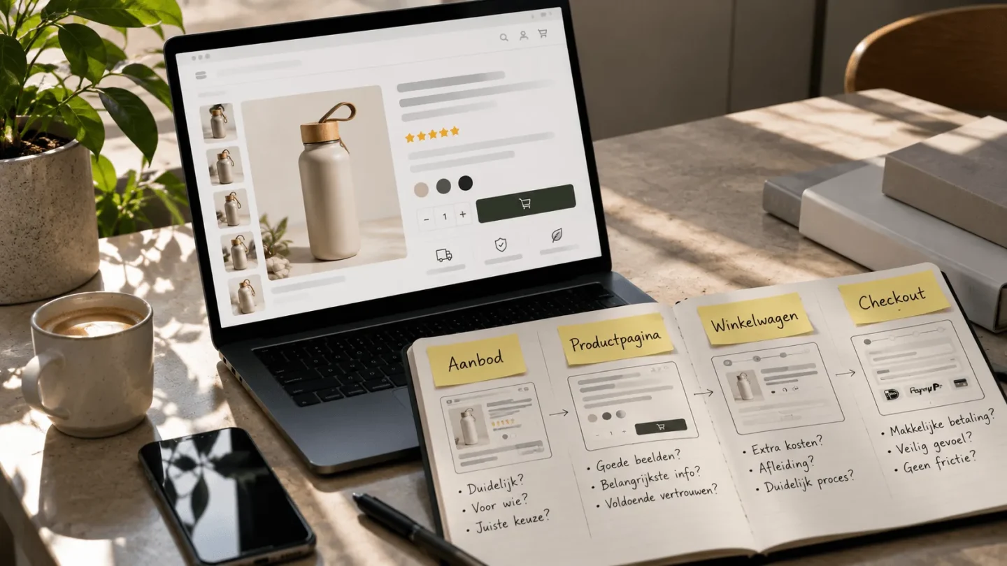
The quickest improvement therefore does not start with more traffic, but with finding out exactly where visitors start to hesitate: before the product page, on the product page, in the basket or at checkout.
If your web shop is live, products are visible and still few orders come in, it quickly feels as if everything is going wrong at once. You wonder whether the prices are too high, whether the ads are not working, whether the product photos need to be better, whether people do not trust your brand. All of that can play a part, but the first question is simpler: at what point does the visitor stop believing that buying is logical, safe and easy.
That is why at BrandMonks we do not just look at individual points for improvement, but at the whole route from visitor to order. A web shop only sells when offer, product page, images, copy, proof and checkout reinforce each other. If one of those parts is not right, a visitor does not even have to consciously drop off. They simply feel slightly too little certainty and click on.
This guide helps you recognise where that can happen. Not as a list of loose tips, but as a diagnosis: which symptom do you see, what does it probably mean and which improvement gives you the best chance of more orders.
Start with the difference between low traffic and low conversion
Many business owners lump two problems together: too few people come to the web shop, or the people who come do not buy. That difference matters. If hardly anyone visits your web shop, the first challenge is usually visibility, findability or advertising reach. Then you can improve product pages, but you have too little data to know for sure where visitors drop off.
If you do have visitors but few orders, it gets more interesting. Then there is often low conversion: people see your offer, but do not feel enough reason to buy. That can be due to unclear product information, mediocre product images, too little trust, wrong expectations set by ads or friction in the basket and checkout.
So a web shop that gets lots of visitors but sells little usually does not have a “more traffic” problem as its first priority. More traffic then mainly increases the number of people experiencing the same doubt. First the web shop has to explain, convince and reassure better. So do not just look at revenue, but at the route towards it: visitors, product views, baskets and completed orders.
Your offer is not clear quickly enough
A visitor often decides faster than a web shop owner thinks. Not definitively, but instinctively. Within a few seconds a first judgement forms: do I understand what this is, does it suit me, does it feel trustworthy and is it more interesting than the alternative I just had open. If that first impression is vague, the rest of the page has to work hard to put it right.
In many web shops the problem is not the product itself, but the way the offer is presented. The title mainly says internally what the product is, the first sentence lists generic benefits and the image is nice but not immediately informative. The visitor has to work out for themselves why this product is handy, better or suitable. That mental effort is exactly where conversion leaks away.
A strong offer makes it clear straight away who the product is for and why someone would choose this particular version. That does not need to be loud. Above all, it needs to be concrete. “Premium quality” says little if the visitor cannot see where that quality lies. With products that look very similar, your web shop needs to make the relevant reason to choose clear faster.
The product page does not answer the real buying questions
A product page can seem complete and still not convince. That happens when all the information is there somewhere, but not in the order in which a customer decides. Specifications are at the bottom, reviews are separate from the main doubt and the product description mainly says what the product is. Then there is content, but no decision route.
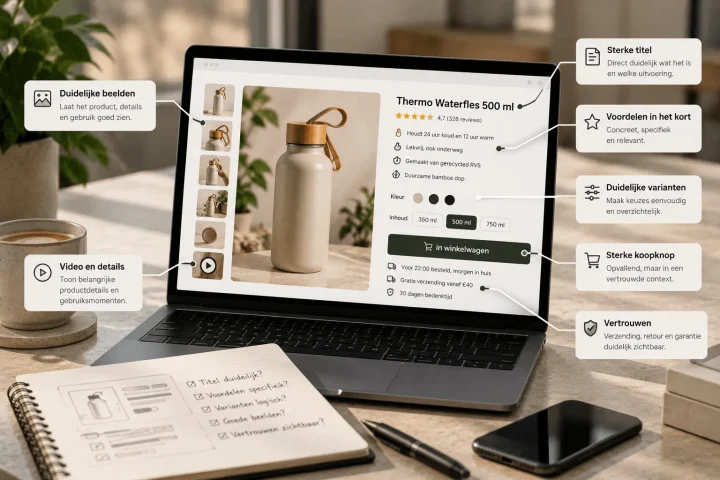
A good product page helps the visitor move from orientation to certainty. First it needs to be clear what they are looking at. Then why this product is relevant. Then which details remove their doubt. And around the moment of purchase they need to feel enough trust to take the step to the basket or checkout. As soon as that order gets messy, the page feels heavier than it needs to.
That is why increasing product page conversion is not a matter of making one button bigger. It is about the whole structure. Which arguments are above the fold. Which images explain the product. Where are the USPs, reviews, guarantees and specifications. And how quickly does someone understand the main choice without scrolling, searching or comparing.
At BrandMonks we therefore look at product pages as a content structure. The page should not just carry information, it should reduce doubt. That calls for a clear e-commerce product page structure in which every part has a role.
Product images remove too little uncertainty
Many web shops underestimate how much selling power lies in product images. Visitors cannot hold the product, turn it, feel it or put it next to an alternative. So the images have to do more than look polished. They have to reduce uncertainty.
That only works when every image has a clear task. The first image needs to make the product instantly recognisable. Detail images clarify material, finish, size or functions. Context images show how the product is used. Explanatory visuals make benefits, packaging contents or differences between variants scannable. If the gallery mainly consists of similar photos, the visitor gets more images but not more certainty.
That is why, with product images for more conversion, we look at the role of images within the whole page. Not every product needs the same image set, but every product does need a logical order: first recognise, then understand, then build trust.
Your web shop gives too little trust at the right moment
Trust does not come only from a quality mark in the footer. It comes from several small signals that together say: this is right, I know what I am buying and I am taking little risk. The problem is often not that trust signals are missing entirely, but that they are in the wrong place. Returns information matters most when someone is about to buy. A guarantee block works better next to a relevant objection than somewhere deep at the bottom of the page.
That is why social proof on the product page works better when it is part of the decision route. A visitor who doubts the quality needs different proof from someone who doubts the delivery or returns.
For BrandMonks, a lot of the gain here lies in visual calm and hierarchy. Proof needs to be visible enough to count, but should not demand so much attention that the page becomes restless. A well-designed trust layer makes buying easier. Not by shouting that the web shop is trustworthy, but by showing just enough proof at the moments the customer needs it.
The step to the basket or checkout feels just a bit too heavy
Sometimes the product page convinces perfectly well, but people still drop out later. You see, for example, that products are viewed or added to the basket, but the order is not completed. In that case the biggest friction is often closer to the purchase: unexpected shipping costs, unclear delivery time, too few payment options, a mandatory account, too many fields or uncertainty about returns.
These are not spectacular problems, but they cost revenue directly. A visitor who had already decided to buy mainly wants the last steps to feel logical. Every surprise at this stage acts as a brake. Especially on mobile, a small lack of clarity can be enough to put off the purchase.
The call to action plays a part here too. A button does not just need to be visible, it needs to be in the right place within a page that has already built up enough certainty. If the customer knows what they are choosing, understands the costs, trusts the delivery and can pay easily, the step to ordering feels much lighter.
Visitors arrive with a different expectation
A web shop can be well built and still sell little if the right people do not arrive with the right expectation. You often see this with ads, social posts or search results that make a promise the landing page does not immediately deliver. The visitor clicks with one idea in mind, lands on a page that feels slightly different and loses momentum.
It does not have to be extreme. Sometimes the ad is very price-focused, while the product page mainly emphasises brand and quality. Sometimes someone is looking for a solution to a specific problem, but ends up on a general category page. In both cases a gap opens up between expectation and experience.
That is why you should not just look at your web shop, but also at the route to it. Which words, images and promises does someone see before they reach the page. Does the product page tie in with that directly. And does the visitor see straight away that they are in the right place.
For BrandMonks this is an important part of conversion optimisation. Not because every channel has to tell the same story, but because the transition has to be logical. A strong web shop immediately confirms the reason someone clicked.
More traffic is not always the answer
It is logical to think of more visitors when orders are low. Without visitors a web shop does not sell. But once relevant traffic is already coming in, more traffic is not automatically the fastest solution. If the page does not convince, you mainly multiply the number of missed opportunities.
Suppose a hundred visitors view your product page and almost nobody clicks through to the basket. Then the problem is more likely to lie in the offer, images, arguments or trust than in reach. If people do reach the basket but drop off there, you look at costs, delivery, payment and ease of ordering. Only when that foundation is right does more traffic become more interesting.
That often makes optimising more efficient than scaling up straight away. You first get more value from existing visitors. After that, marketing can work harder, because the web shop is better prepared for the attention you bring in. For web shops with lots of products, this means improvements need to become repeatable. Optimising a single page is useful, but fixed structures for product pages, image sets and content blocks stop the same conversion problems coming back time after time.
Quick diagnosis: where is your web shop probably leaking revenue?
If you want to know why your web shop is not selling, start with the visible symptom. Not every problem calls for the same solution. A web shop without visitors needs a different approach from a web shop with lots of product views but few baskets. And a web shop with lots of baskets but few completed orders probably has yet another leak.
| Signal | Probable cause | First point to improve |
|---|---|---|
| Few visitors | Visibility or audience reach is too limited | Work on findability, campaigns or channel choice before drawing conclusions about conversion |
| Lots of visitors, few product views | Wrong expectation or weak navigation | Align landing page, categories and promise more closely |
| Lots of product views, few baskets | Product page is not convincing enough | Improve title, main image, USPs, product information and proof |
| Lots of baskets, few orders | Friction around costs, delivery, payment or checkout | Make total costs, delivery time, returns and payment options clear earlier |
| Lots of customer questions before purchase | Information is not clear enough on the page | Add better explanations, visuals, specifications and FAQ |
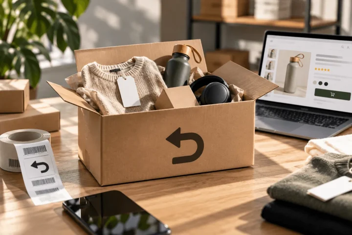
| Lots of returns after purchase | Expectation and reality do not match closely enough | Improve product images, sizing, specifications and context of use |
How BrandMonks looks at a web shop that is not selling
When we assess a web shop that sells little, we do not just look at design. Design matters, but it has to visibly contribute to understanding, trust and action. A beautiful page that does not help the customer choose stays commercially weak.
That is why we start with the commercial route. What does someone need to understand before buying. Which doubts arise with this type of product. Which information needs to be at the top. Which images remove the most uncertainty. Where does proof need to be visible. And how do we make sure that logic also works for a range or product line.
That is where the strength of BrandMonks lies: setting up visual content and copy so that it works at scale. For a small web shop, that can mean sharpening the structure of the most important product pages. For a larger brand, it can mean working with fixed templates, image roles, USP blocks and reusable components in Figma.
That also fits our broader web shop approach. We look at look and feel, structure, product content and conversion as one whole. Not because every company needs a completely new platform, but because many sales problems become visible in the coherence between page, image and promise.
Frequently asked questions about a web shop that is not selling
Why is my web shop not selling?+
Usually it comes down to one of three causes: too few relevant visitors come in, the product page is not convincing enough or customers drop off around the basket and checkout. So first look at where visitors disappear before choosing individual improvements.
What if my web shop gets visitors but no sales?+
Then the problem probably lies in expectation, product presentation, trust or purchase friction. Check whether visitors land on the right page, whether the product page makes it clear quickly enough why the product is relevant and whether costs, delivery and returns are clear early enough.
Do I need to have my web shop rebuilt if it is not selling?+
Not automatically. Improvements to product pages, images, copy, trust signals and checkout often deliver more than rebuilding straight away.
Do better product photos really help you sell more?+
Yes, if the images do more than look nice. Product photos and visuals need to answer questions about size, material, use, contents, variants and benefits. Images that remove uncertainty can contribute directly to more baskets and less doubt.
Conclusion: sales start with less doubt
A web shop that does not sell is usually not missing one magic fix. The problem more often lies in doubt that arises in several places: an offer that is not clear quickly enough, a product page that does not answer buying questions in the right order, images that give too little certainty, trust signals that come too late or checkout friction.
The best first step is therefore diagnosis. Do not just look at revenue, but at the route towards it. Where do people drop off. Which questions remain unanswered. Which expectation is not met. And which improvement can then be applied repeatedly to more products.
For BrandMonks, that is exactly what strong e-commerce content is about. Not just a prettier page, but a better decision route. With a clear product structure, converting visuals, sharp copy and scalable templates, your web shop becomes easier to understand, more trustworthy to buy from and quicker to expand.

Melle Sikma
Helmsman
melle@brandmonks.nl