Increasing product page conversion starts with clarity, not more tricks
For many e-commerce teams, increasing product page conversion is not about yet more standalone CRO tricks, but about one far more fundamental question: does a visitor understand within a few seconds what you sell, why this product is relevant and why your version is worth it? If that is not immediately clear, extra badges, buttons or psychological micro-tweaks only help so much. At that point you are trying to make up for doubt that already arose earlier on the page.
That is exactly where things often go wrong in practice. Many product pages contain enough information on paper, yet still feel unclear in use. The title does not say enough. The first image does not show quickly enough what matters. The USPs are too generic. The reviews are there, but they do not build real trust. Variants take more thinking than they should. The result is predictable: people scroll, compare, hesitate and drop off.
For BrandMonks this is not a purely theoretical CRO question. We see it as a visible content problem. A product page usually converts better when images, order, arguments and proof reinforce each other. Not when every element has been optimised separately, but when the whole page feels like one logical story. Then a visitor understands faster what they are looking at, why it is relevant and what to do next.
That also makes this topic interesting for brands with many products or variants. As long as product pages are still solved by hand one at a time, it may look as if conversion mainly depends on details. But as soon as you manage several product families, you see that structure and repeatability matter at least as much. A clear product page is not only better for one product, it also forms the basis for scalable growth across your whole range.
In this guide we therefore show how increasing product page conversion works in practice. Not through general tips for your web shop, but through the parts that really make the difference: layout, above-the-fold clarity, product images, USPs, proof, variant presentation and templates that let you roll this out consistently.
Why many product pages inform but do not persuade
Many product pages do not fail because there is too little on them, but because everything is trying to talk at once. The visitor gets a product title, several visuals, a price, a variant selector, a few bullets, maybe a badge, a discount block, a stock notice, delivery time, reviews and a long piece of content underneath. Each part has a function on its own, but together they often do not form a clear decision path. As a result, information does not automatically turn into persuasion.
That difference between informing and persuading matters. Informing means the content is present somewhere on the page. Persuading means the content becomes visible at the right moment, in the right order and with enough context to make a decision easier. A visitor does not need to read everything. Above all, they need to understand quickly what the product does, who it is for, how it differs and why they can buy it here with confidence.
Product pages lose conversion as soon as that logic is missing. That happens, for example, when a product title only gives a name but no use case or relevant benefit. Or when the first image is attractive but does not help anyone understand the product faster. You also often see USPs that stay too general. Words like premium, high quality or sustainable are not necessarily wrong, but they only persuade when a visitor can link them straight away to something concrete. Without that link, they remain slogans.
A second reason is visual noise. Many shops stack blocks on top of each other without a clear hierarchy. Everything tries to be important, so nothing really gets priority. The visitor then has to work out for themselves what to read first, what is proof, what is marketing language and what they need to remember. That takes energy. And on product pages, friction almost always means lost conversion.
On top of that, the difference between product information and buying arguments is often not drawn sharply enough. Specifications are useful, but they are not the same as sales arguments. Reviews are valuable, but they are not the same as clear USPs. Variants are important, but they should not feel heavier than the product itself. When all those layers blur together, the visitor partly understands the page but gets too little direction to actually click through to the basket.
There is also a practical point: many product pages grew out of growth, not out of a system. The first product got attention, the second one too, and after that blocks were copied, adjusted and added to. Over time you end up with a page layout that was never consciously designed but grew organically. That is an important difference. Because a product page that happened to turn out this way usually performs less consistently than one deliberately built around understanding, preference and trust.
The basic structure of a product page that is understood faster
A good e-commerce product page structure does not start with design, but with a question of priorities: what must a visitor understand first for the rest of the page to make sense? If you have not answered that question sharply, the layout automatically becomes messy. Each block then gets its own role, but the main route through the page is missing.
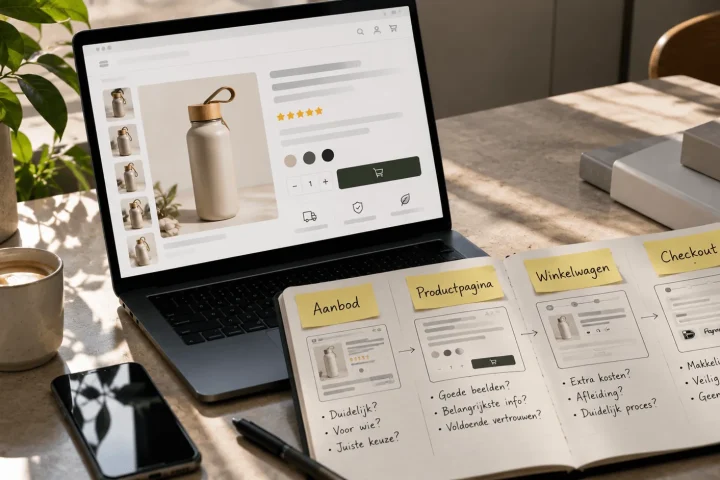
At its core, a product page has to do five things. It has to identify the product, clarify the benefit, build trust, make variants or choices understandable and support the moment of purchase. That sounds simple, but in practice these functions often get mixed up. That is exactly why a fixed basic structure matters so much.
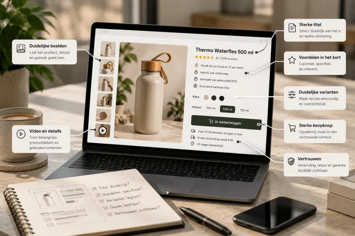
The first layer of the page should be about quick orientation. That includes a clear product title, a first image that makes the product instantly recognisable, a price and availability block that is not hidden away and a short set of arguments that sum up the difference. Not every brand uses exactly the same words or order, but in this part of the page the visitor should immediately get a grip on what they are looking at.
Next usually comes the in-depth layer. This is where there is room for explanation, extra images, specifications, use cases, comparisons between variants or deeper benefits. This part is not meant to make the visitor work out all over again what the product is. Its main job is to confirm the first impression and remove objections. That difference is key. A visitor who is still trying to understand the product above the fold is already behind.
Only after that comes the supporting layer: proof, reviews, guarantees, extra context, FAQ and any additional content. These parts are important, but not as an opening. As soon as a page jumps into proof or detail too early without first making the core clear, the experience feels heavier than it needs to.
A workable product page therefore has a clear rhythm. Understanding first. Then depth. Then confirmation. That logic sounds almost obvious, but in many shops it is not closely guarded. The result is that visitors see a lot but experience too little direction. And that is exactly why product page structure has a direct impact on conversion. We go deeper into that layout in e-commerce product page structure.
For BrandMonks this is also where content design and scale meet. Once you have a strong structure clearly defined, you can repeat it across product families. Product page optimisation then stops being a separate task per SKU and becomes a system in which fixed blocks, a fixed order and fixed visual choices return without every page having to be identical.
So the best structure is not the page with the most parts, but the page where every part knows exactly when it is its turn. That sounds strict, but it actually makes product pages lighter. Less searching for the visitor, less room for interpretation and a better chance that the content really works as intended.
What must be clear immediately above the fold
The area above the fold has a disproportionately large influence on product pages. Not because the rest of the page is unimportant, but because this is the moment a visitor decides whether scrolling further is worth it. That first screen does not have to say everything, but it does have to say enough to make the rest of the page make sense.
Above the fold, the main things to make clear are what the product is, why it is relevant and whether this product is likely to suit the visitor. That calls for a combination of title, image, price, choice elements and short arguments. When one of those parts becomes too vague or too busy, the whole first impression slows down.
The product title is usually the first anchor. It needs to do more than give a name. A strong title helps the visitor place faster what kind of product this is, in which context it is used and which version they are looking at. That is especially important for products with lots of variants, technical differences or unclear brand names. A title that only makes sense internally but says little externally immediately increases the cognitive load.
Then the main image takes over. That image should not only be attractive, but above all informative enough to pin down the essence quickly. Sometimes that means a clean packshot. Sometimes it means an image that shows use, scale or benefit. What works depends on the product, but the standard question stays the same: does this image help someone understand faster what they are buying? If the answer is no, it is mostly decoration.
Price and availability should also be easy to find straight away. Not because price is always the deciding argument, but because uncertainty about it raises unnecessary doubt. The visitor wants to know immediately whether this product fits their expectations and whether they can go ahead at all. The same goes for the main variants. If someone first has to search for how to choose a colour or size, friction appears at the wrong moment.
Above the fold is also the place for a compact summary of product benefits. Not in long paragraphs, but in short scannable blocks or bullets that communicate the difference directly. This is not about full proof but about direction. Proof can be worked out further down the page, but above the fold the visitor should already feel why this product is worth it.
A common mistake is that shops want to overload this area. Extra badges, timers, coupon notices, banners, icons and microcopy then seem intended to add more persuasion, but actually push the core aside. More elements do not automatically mean more persuasive power. Often the opposite is true. The clearer the priorities above the fold, the more easily the rest of the page works.
Product images that do not just look good but also sell
Product images for more conversion call for a different mindset than product images for looks alone. Beautiful images can attract attention, but converting images help someone decide. That difference seems small, but on product pages it is huge. A visitor does not just want to see that the product looks good. They want to understand what they are getting, how it is used, how it stands out and whether it matches their expectations.
That is why you should see product images as a functional layer of the page. The main image has a different task from the detail images. A lifestyle image has a different task from a visual with a USP overlay. A close-up of the material has a different task from a comparison between variants. As soon as all those image types get mixed up without a clear role, you end up with plenty of visual material but less understanding.
In many shops you see that the first image was chosen mainly for aesthetics. That can work for brands that already enjoy a lot of trust or recognition, but for many products it is smarter to make the main image informative too. The visitor should see straight away what kind of product it is, which version they are looking at and which context is relevant. In some categories a clean packshot therefore works better. In other cases an image showing the product in use works better. The choice should be functional, not just visually pleasing.
After that usually come the in-depth images. This is often where the biggest gains are. Detail shots can clarify material, finish or product features. Context images show scale, application or use case. USP images can help anchor benefits without the visitor having to read long texts. It is exactly that combination that makes a product gallery strong: not the same product six times from a slightly different angle, but a visual route that gives more certainty step by step.
For BrandMonks this is one of the most tangible differences between decorative content and converting content. We often see product images perform better as soon as they are put in a clear image order. Recognition first. Then a relevant benefit. Then detail or proof. Then, if needed, use or comparison. Once that logic is right, the whole product page feels stronger, even if the individual images are not completely new.
That also makes image logic scalable. If you know which role each type of image plays, you can develop fixed sets per product family. Optimising product images on product pages then stops being a separate creative project every time and becomes a repeatable method. That is especially valuable for teams with many variants or recurring product structures. They gain not only in conversion, but also in consistency and production speed. We go deeper into that image logic in product images for more conversion.
One last pitfall is that teams sometimes link images too late to the customer’s actual points of doubt. Product photos are then judged on taste instead of function. It is better to ask for each image: which question does this take away? If an image does not answer that question, it probably adds less than you think.
Showing USPs without slipping into generic claims
Showing USPs on product pages seems simple, and that is exactly why it often goes wrong. Many product pages do list benefits, but not in a way that makes a difference. The claims are too general, too predictable or too loosely connected to the product itself. Then it says something like high quality, smart design or premium finish, but the visitor learns too little from it to really choose.
The problem is usually not that teams cannot name benefits. The problem is that benefits are too often presented as loose marketing words instead of scannable and credible decision arguments. A strong USP does not just say what is good, it also makes clearer, faster, why that matters for this product and for this visitor.
That is why a good USP structure works better than a loose list. The claim itself should be compact, but the context around it has to come along visibly. Sometimes that is a short supporting sentence. Sometimes an icon or visual. Sometimes a detail image that shows why a certain benefit really exists. As soon as claim and proof meet, the product feels much stronger. As soon as they drift apart, it feels like standard marketing language.
A second point of attention is priority. Not every USP needs to be equally large or appear equally early on the page. Some benefits directly influence the choice and some only become relevant later. By showing all USPs at the same level, a page loses direction. That is exactly why the order matters so much. What should someone remember first? Which benefit removes the biggest doubt? And which benefit belongs further down the page?
For BrandMonks, this is again where visual execution comes in. USPs work better when the page does not just mention them but also visibly supports them. That can be done with fixed benefit blocks, icons, short lines of proof or images in which the benefit can already be felt. Not every product needs the same form, but every product does benefit from consistent benefit logic. That makes showing product benefits on product pages far more effective than simply adding three bullets next to the price. We go deeper into that benefit layer in showing USPs on the product page.
Genericness is the biggest enemy. The broader the claim, the less it helps. That is why it almost always pays to make USPs sharper. Not: durable material. But: hard-wearing material that keeps its shape with daily use. Not: fast delivery. But: delivered tomorrow if you order today. Not: premium design. But: compact design that takes up less space in your kitchen. The more concrete the translation, the more easily the visitor feels a reason to choose this product.
Building trust with proof, reviews and trust signals
Even a clear product page does not convert well if a visitor feels they understand the product but do not yet fully trust the purchase. That is exactly where social proof, reviews and trust signals do their work. Not as decoration, but as confirmation. They signal to the visitor that other people have already chosen this product, that the shop is reliable and that the promises on the page are backed by something.
Yet these elements are often used too mechanically. A few stars under the title, a badge at the side, a quality mark in the footer and done. That is better than nothing, but it does not use the full power of trust. On product pages, proof works best when it addresses the doubt that is still alive at that moment. That means placement and context matter more than the simple fact that the elements are there.
Reviews are a good example. A review score above the fold can work well if it quickly shows that others rate the product positively. But more detailed review content often only works further down the page, when a visitor is looking for more detail. The same goes for badges. A badge that is relevant to delivery, guarantee or safety helps most when it is visible at the moment a visitor is thinking about those aspects.
Trust signals on a product page should therefore not be seen as a loose checklist. They are part of the page’s logic. Above the fold they can help catch uncertainty early. In the middle of the page they can confirm a USP. Around the moment of purchase they can offer extra reassurance. That spread makes a big difference.
For BrandMonks, the strength here also lies in how proof is made visible. Reviews, guarantees, badges and proof elements should not only be present, they should also fit the rest of the page. As soon as trust blocks are visually disconnected from the product communication, they feel more like an add-on than a convincing confirmation. Consistent design, a clear hierarchy and good placement mean that proof does more with less noise.
It is also wise not to narrow trust down to reviews alone. Returns information, delivery time, guarantee, customer ratings, quality marks and even the way specifications are presented can all contribute to a more reliable feel. Especially with more expensive or more complex products, trust often comes from the sum of several small signals, not from one big block of proof. For the exact placement of reviews, badges and reassurance, social proof on the product page is the logical next read.
Presenting variants logically without choice stress
Variant presentation on product pages often looks like a detail, but in many categories it directly determines conversion. As soon as a visitor does not understand which version they are looking at, which variants are available or what the difference between them is, their attention shifts from buying to figuring things out. That takes energy. And the more figuring out a visitor has to do, the bigger the chance they postpone or drop off.
That problem arises faster than many teams think. A colour variant without a clear image seems minor, but can be enough to cause doubt. The same goes for sizes without context, flavours without a logical order or variants that are in a selector but are not properly supported elsewhere on the page. The product page then does not feel like one product experience, but like several half versions mixed together.
Good variant presentation therefore starts with a simple question: what does a visitor need to see straight away to make a choice with confidence? Sometimes that is mainly visual. Then colour or design differences have to be clear at once. Sometimes it is about content. Then it has to become visible quickly what changes functionally between variants. In both cases the choice should be understandable as early as possible.
A strong product page does not just let people select variants, it also helps them understand them. That means images, price, title, summary and, where relevant, USPs need to change along with the selection. As soon as the visitor picks a variant, the page should confirm that choice instead of raising extra questions. That is a subtle but important difference.
For brands with many product families, this is also a question of scale. Showing variants logically does not work by solving one-off exceptions over and over. It calls for clear variant logic per product type. When do you share one page across several variants? When do you give variants their own product page? Which images stay shared? Which content changes along? How do you make sure those choices stay consistent across the whole range? That is exactly where calm emerges on the page and in the operation. We go deeper into that choice support in variant presentation on the product page.
For BrandMonks there is a direct link here with templates and product families. As soon as variant presentation is built from a fixed system, you can roll out much faster without every new variant making the page chaotic again. That is not only better for conversion, but also for scalability and brand consistency.
Making product pages scalable with fixed templates and blocks
A product page can be strong in content and still become a problem over time if every new product is built again from scratch. That often happens in growing shops. The first pages get attention, but as the volume rises, exceptions, extra blocks and one-off solutions creep in. It then looks as if you keep optimising, while in reality you are mainly adding variation.
Creating product page templates is therefore not a limit on creativity, but a way to make quality repeatable. A good template does not dictate every sentence or image, but it does fix the load-bearing structure. Which blocks always return. In which order. Where the USPs go. How proof is shown. Where variants are supported. Which visual logic has to hold up per product family.
That is exactly the point at which making product pages scalable becomes interesting for brands with several ranges. Once the basis is in place, you can add pages faster without having to reinvent every product page. You keep more consistency in brand presentation, more calm in the structure and less noise in content between products that are really part of the same family.
For BrandMonks this is a familiar field, because content, visuals and Figma logic come together here. A template is not just a wireframe. It is a production agreement. Which image types belong to which product group. Which components return. How copy blocks, USP blocks, specifications and proof blocks alternate. Once that logic is in place, execution becomes faster and stronger.
Templates do not have to be rigid either. The best templates leave enough room for product-specific accents, as long as the core structure holds. That difference matters. A template that is too strict soon feels generic. But a template without clear boundaries loses its advantage of scale. The art lies in finding fixed blocks with enough flexibility per product group. For the template approach itself, creating product page templates is the logical next read.
That makes templates extra valuable for e-commerce teams that want to keep growing without quality falling apart. As long as product pages remain entirely handmade, improvement takes a lot of capacity. As soon as fixed blocks, fixed image roles and fixed orders emerge, optimisation becomes not only easier to carry out, but also easier to measure. You then see faster which block really works, which order brings calm and which visual choices contribute to understanding and conversion.
Comparison: messy product page versus converting product page
The difference below shows clearly why some product pages sell and others mainly contain a lot of information.
| Element | Messy product page | Converting product page | Effect on understanding and conversion |
|---|---|---|---|
| Above the fold | Attractive but unclear opening with too many signals at once | Quick orientation with a clear title, image, price and key benefits | Visitor understands faster whether the product is relevant |
| Product images | Several images without a clear role or order | Image set with recognition, detail, context and proof | Less doubt and better product understanding |
| USPs | Generic claims without a concrete translation | Scannable benefits with brief backing or visual support | More persuasive power without extra text clutter |
| Trust signals | Loose badges and reviews without logical placement | Proof at the right moments in the decision path | More trust around comparison and the moment of purchase |
| Variants | Unclear choices and limited confirmation after selection | Clear variant logic with content and images that change along | Less choice stress and fewer drop-offs |
| Structure | Every block tries to be equally important | Fixed hierarchy of understanding, depth and confirmation | Calmer reading behaviour and a higher chance of conversion |
Frequently asked questions about increasing product page conversion
How do you increase the conversion on a product page?+
By improving the clarity of the page first. Visitors need to understand quickly what the product is, why it is relevant, which benefits it offers and why they can buy it with confidence.
What should a good product page contain?+
A good product page contains at least a clear title, strong product images, a clear presentation of price and variants, scannable USPs, relevant specifications and enough proof in the form of reviews or trust signals.
How important are product images for conversion?+
Very important. Product images do not only determine the look, they mainly help people understand the product faster, see differences and remove uncertainty during the decision process.
How do you show variants on a product page without confusion?+
By making the differences between variants clear both visually and in content, and by letting the title, image, price or summary change along properly as soon as a visitor chooses a variant.
When are product page templates a smart move?+
As soon as you manage several products or product families. Templates help you hold on to structure, brand consistency and image logic without building every product page again from scratch.
Conclusion: a product page only converts when images, order and proof work together
Increasing product page conversion rarely succeeds with one standalone change. The page usually improves as soon as the whole layout becomes more logical: the product is understood faster, the images genuinely help with the choice, benefits are concrete, proof is in the right place and variants do not add extra noise.
That is also where the real gain lies for brands that want to scale. A good product page is not only clearer for the visitor, it is also easier for the team to repeat. At BrandMonks we help exactly at that intersection: making product communication visibly stronger with smart structure, consistent visuals, fixed blocks and templates that keep working across product ranges. Want to translate that to your own pages? Then book an introductory call. That way a product page does not just become prettier, but demonstrably more persuasive.

Melle Sikma
Helmsman
melle@brandmonks.nl