Showing USPs on a product page: why loose claims rarely convince
A USP only helps on a product page when a visitor immediately understands what the benefit is for them.
Strong product benefits do not feel like advertising words, but like clear reasons to choose faster.
Many product pages do contain USPs, but mainly use them as filler around the price or CTA. Then you get a row of words like premium quality, fast delivery or smart design, without it being clear straight away why that is really relevant for this product. On paper it looks convincing. In practice it stays too vague to make the choice easier.
That is exactly the difference between visible benefits and loose claims. A visitor does not just want to see that a brand promises something. They want to understand which problem it solves, what benefit it gives and why they should believe it. As soon as that translation is missing, USPs on product pages remain mostly marketing speak.
For BrandMonks this is not a small copy detail, but a structural part of conversion. Product benefits only really work when they are in the right place, in the right form and tie in with image, proof and context. In this guide we therefore show how to make USPs on a product page scannable, credible and commercially stronger.
Why many USP blocks stay too generic
The biggest problem with USPs on product pages is usually not that there are too few benefits, but that they are worded too generally. Many brands use words that come back in almost every category: high quality, durable, stylish, user-friendly, fast delivery. Claims like these sound safe, but only help a visitor if they immediately understand what they mean in this specific case.
That is often exactly where it goes wrong. A claim like premium finish says little as long as you do not show what is premium about it. Fast delivery sounds good, but convinces more when the page says what the promise means in concrete terms. Durable material only becomes relevant when the visitor can link it to a benefit in use, lifespan or maintenance.
USPs that are too general not only make a product page weaker, but also interchangeable. As soon as the same words could have been on ten competing pages, you lose what sets you apart. That does not mean a benefit has to be unique on a global level. It does have to be product-specific, aimed at the target group and concrete enough to really add something to the decision.
That is why strong USP communication does not start with nice words, but with a sharp translation. Not: compact design. But: takes up less space on your worktop. Not: sturdy material. But: stays stable with intensive daily use. Not: fast delivery. But: with you tomorrow if you order today. The more concrete the translation, the faster a visitor feels a reason to take this product seriously.
The difference between features, benefits and proof
A lot of confusion around product benefits arises because features, benefits and proof get mixed up. A feature is a property of the product. A benefit is the advantage the customer notices from it. Proof is the reason why that benefit is credible. As soon as those three layers are not kept apart, you get USP blocks that do say something, but do not really convince.
A feature might be that a bag has a water-repellent outer layer. The benefit is then not simply water-repellent, but that the contents stay better protected when you are out and about in rainy weather. The proof can be in material information, a detail photo, a close-up of the coating or a short explanation of the construction. Only when those layers connect properly does the benefit really land.
That difference matters for the structure of a product page. A feature without a benefit feels technical. A benefit without proof feels like marketing. Proof without a clear benefit feels like loose product information. Strong USPs therefore always connect these three elements, though that does not have to take long text. Sometimes a short benefit line with a supporting detail image is enough.
For the overall order of blocks on the page, e-commerce product page structure is the logical next read. This page zooms in on how product benefits work better within that structure.
Which USPs belong above the fold
Not all of the product’s benefits belong above the fold. That is where the benefits that directly influence the first choice need to be visible. Those are usually the points someone needs to judge quickly whether this product is relevant, attractive and reliable enough to look at further.
In practice it is often about one main benefit and two or three supporting points. The main benefit gives the strongest reason to read on. The supporting benefits remove the first doubts or help the relevance land faster. Think of ease of use, size, delivery, a material advantage, compatibility or an important distinguishing feature.
What belongs above the fold does depend on the product type. For a technical product, compatibility or performance is more often the main benefit. For a home product, it is more about use, size or look. For personal care products, the effect or application can be decisive. The rule stays the same: above the fold you show not what is complete, but what is decisive.
This ties in directly with increasing product page conversion. Above the fold a visitor does not need to know everything yet, but they do need to feel enough not to drop off.
Where to place USPs on a product page
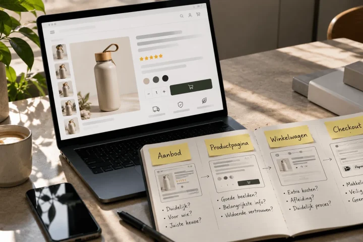
USPs work best when their placement follows the kind of doubt you want to resolve. Some benefits need to be visible early, others actually work better lower down the page. As soon as all product benefits are lumped together, the page loses direction.
Around the product title, price and CTA, the shortest and most decisive benefits usually work best. These are the benefits someone needs to understand quickly why this product is relevant. Further down the page you can go deeper into product benefits with extra explanation, short use cases, visual support or additional proof. That is often where a benefit block becomes stronger than a loose bullet list.
USPs can also work well next to or below images, provided they do not repeat what the image already fully explains. A product image can, for example, make scale, material or use visible, while a short benefit line makes the advantage concrete. For that interplay, product images for more conversion is the logical next read.
It is important that USPs do not have to say the same thing again in every spot. Once a benefit is already clear above the fold, it does not need to come back later in almost the same wording. It is better to go deeper, back it up or visualise it lower down the page. That makes the page calmer and more convincing at the same time.
How many USPs you really need to show
More USPs does not automatically mean more persuasive power. In many cases a limited number of strong product benefits works better than a long row of half-relevant claims. As soon as a visitor has to process too many points at once, it becomes harder to remember what really matters.
For many product pages, a set-up with three core benefits works well. Sometimes a fourth point makes sense, but rarely is a whole list of seven or eight equally strong benefits really needed in the first buying section. The more points you show, the more important the hierarchy becomes. There always has to be a clear first reason to choose this product.
That does not mean all the other benefits have to disappear. It is often smarter to limit the number of visible core benefits and let the rest come back later on the page, or indirectly through specifications, visuals or proof blocks. That keeps the first layer sharp, and the rest of the page stays useful for going deeper.
How to make product benefits scannable with icons, short copy and benefit blocks
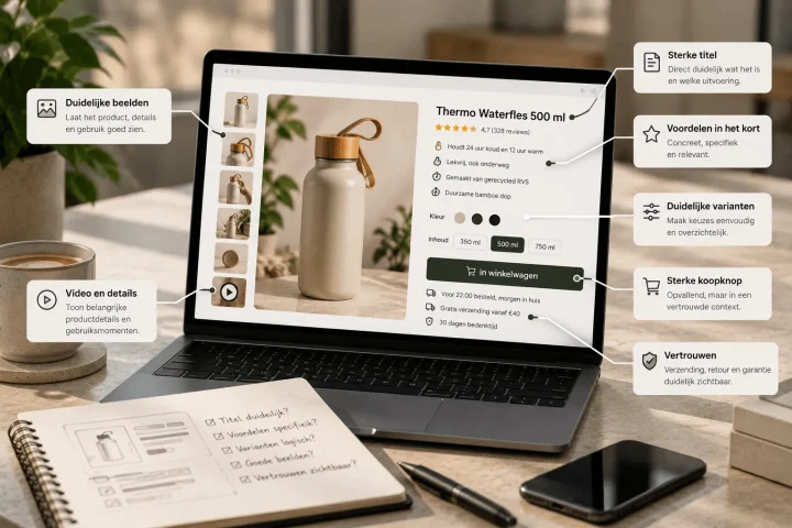
Scannability is vital on product pages, because visitors rarely want to process product benefits as long paragraphs. They want to see the essence quickly. Short benefit blocks often work better for that than extensive sales copy. A strong benefit block combines a clear heading with a very short explanation that says straight away why this benefit is relevant.
Icons can help, but only if they stay supportive. An icon on its own does not convince. It only works if it makes the right benefit recognisable faster. If you use icons too decoratively or too randomly, they mostly add visual clutter. If you use them functionally, they help people scan faster and remember better.
The copy itself also has to stay short enough to land in a few seconds. That does not mean everything has to go back to loose marketing slogans. A short sentence with concrete meaning often works better than a bare label. For example, not just free returns, but free returns within 30 days. Not just space-saving, but a compact size that takes up less space on your desk. Wording like that stays scannable, but feels less empty.
At BrandMonks we see that benefit blocks perform better as soon as they are not only neatly designed, but also have a clear division of roles between them. In practice that is often just as much a content design question as a copy question. A block should not just be an extra row of arguments. It should form a quick decision layer that connects logically to the title, image and CTA.
How to make USPs credible with proof, visuals and specificity
A product benefit only really convinces when a visitor feels it is not just a claim. Credibility therefore comes from backing it up. Sometimes that is in concrete language. Sometimes in an image that makes the benefit visible. Sometimes in a detail, comparison, review or short explanation that anchors the benefit.
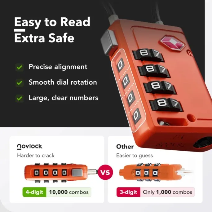
Specific language is the first step. The more concrete a benefit, the more credible it usually feels. Premium quality says little. Double-stitched material that stands up better to daily use says much more. Lightweight sounds general. Only 1.2 kilos and therefore easier to take with you immediately feels more tangible. Specificity reduces interpretation and increases trust.
After that, visual support helps. A close-up can show material quality. A context image can clarify size or use. A simple explanatory visual can show why a construction is smarter. It is not about more images, but about proof that ties in directly with the benefit. That is exactly why the combination of USP and image is often stronger than text alone.
Finally, social or functional proof also works. Reviews, figures, guarantees or product details can make a benefit more credible, as long as they stay relevant. Not every benefit needs a review, but every important benefit does gain from some form of support. Otherwise it depends too much on trust in the writer instead of trust in the product. For exactly how to use reviews, badges and guarantees, social proof on the product page is the logical next read.
What works better: text, visual or a combination
The question of what works better, text or visual, is usually slightly the wrong question on product pages. In practice the combination works best, as long as text and image are not trying to do exactly the same thing. A visual is strong in quick recognition, context and tangibility. Text is strong in nuance, translation and precision. Once you divide those roles well, they reinforce each other.
A product benefit like compact design, for example, can be supported visually with an image in use or a size comparison. The text then only needs to explain why that compactness is handy for the customer. Conversely, a text benefit like with you tomorrow can be made credible with delivery information or clear service context, without needing a big visual.
That also means you have to choose per benefit which form does the most work. Some USPs can be made almost entirely visual. Others call for short but clear copy. And others need both. For that broader interplay, the balance between text and visuals on product pages is the logical next read.
Comparison: generic USP block versus convincing benefit block
The difference below shows clearly why some product benefits stick and others do not.
| Element | Generic USP block | Strong benefit block | Why it works better |
|---|---|---|---|
| Wording | Short marketing words without context | Concrete benefit sentence with direct relevance | Visitor understands faster what is in it for them |
| Content | Features and benefits mixed up | Clear translation from property to customer benefit | Less interpretation and more persuasion |
| Placement | Loose row without a clear function | Around image, price or CTA at the right decision moment | Benefit lands while the doubt is still there |
| Visual support | Only icons or only text | Functional combination of short copy and a fitting image | More scannable and more credible |
| Proof | Claim stands on its own | Claim is backed up with detail, explanation or proof | Less of a marketing feel and more trust |
| Number | Long list of equally important points | Limited number of core benefits with a clear priority | More focus and better recall |
Frequently asked questions about USPs on product pages
Where do you put USPs on a product page?+
The most important USPs usually belong around the first buying section of the page: by the title, image, price and CTA. You can go deeper into or back up further benefits later on the page.
How many USPs should you show on a product page?+
For many product pages, a set of about three core benefits works well. Sometimes four points make sense, but too many claims at once often make the page less sharp.
What is the difference between features and benefits?+
A feature is a product property. A benefit is the advantage the customer notices from it. Good USPs therefore always translate features into benefits that feel relevant for use, convenience or result.
When do you use icons with USPs?+
Icons are useful when they make product benefits faster to scan. They work less well when they are only decorative or have no clear role in the content.
How do you make product benefits credible?+
By wording benefits concretely and supporting them with proof, visuals, specifications or relevant explanation. The more specific and tangible the benefit, the more credible it usually feels.
What works better for USPs: text or visual?+
Usually the combination works best. The image helps people recognise and understand quickly, the text makes clear why that benefit matters to the customer.
Conclusion: strong USPs on a product page feel like clear benefits, not advertising words
Showing USPs on product pages only really works when product benefits are presented not as loose slogans, but as clear help in choosing. A visitor wants to grasp quickly what the benefit is, why it is relevant and why they should believe it. Once those three layers are right, USPs become a commercially strong part of the page instead of a decorative row next to the price.
That is also where the real gains are for growing e-commerce teams. Not in more claims, but in sharper benefit logic. If you word product benefits well, place them logically and back them up visibly, you make product pages not only more convincing, but also more consistent across your whole range.

Melle Sikma
Helmsman
melle@brandmonks.nl