Packaging for product variants only works when recognition and difference are both right
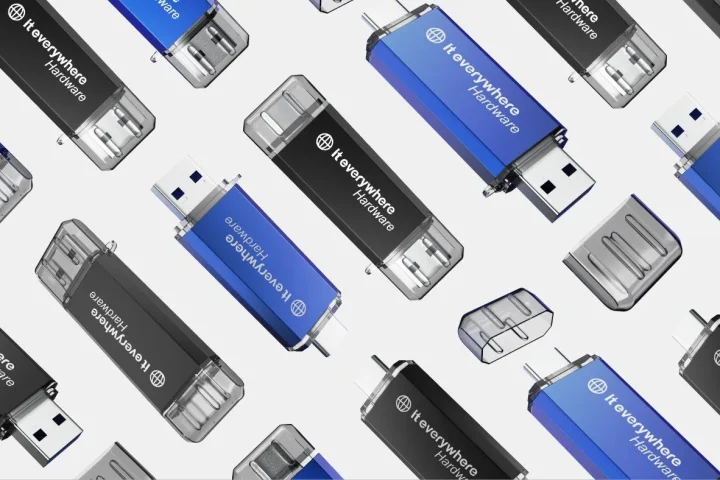
Packaging for product variants rarely fails for lack of creativity. It usually goes wrong because brands have to hit two goals at once and have no fixed logic for doing so. The line has to stay recognisable as a family, but each variant also has to show its difference quickly. As soon as one of those two falls away, friction appears. Either everything looks too similar, or everything looks like it has nothing to do with the rest.
That problem grows as soon as a range grows. A brand often starts with one or two products and can still decide intuitively which colour, claim or image goes where. But as soon as flavours, scents, sizes, bundles or versions are added, improvisation stops working. Packaging is then no longer a standalone design exercise, but a question of systems.
That is exactly why variant packaging always has to do more than look neat. It has to make sure a customer sees quickly, online and offline, what belongs together, what is different and what they are looking at. That applies on product pages, in thumbnails, on shelves and on delivery. Strong product packaging therefore builds not just an attractive front, but also clear family and variant logic.
If you want to design packaging for product variants well, you should not start with “which colour do we give this flavour”, but with “which parts of the line must always stay recognisable and which parts are deliberately allowed to differ”. That is the basis of a scalable range.
Why variants cause visual chaos faster than many brands think
Many teams underestimate how quickly visual chaos appears once a product line gets broader. A single pack can feel strong, but a line of eight, twelve or twenty variants makes a very different demand. Then it is not only about whether each pack works on its own, but above all whether the whole stays readable.
Every extra variant adds a new layer of decisions. There is a different flavour name, a new colour accent, perhaps a different claim, sometimes a specific image or a different format. If those choices are solved slightly differently each time, the line quietly drifts apart. The packs still formally belong to the same brand, but visually they no longer feel like a coherent system.
That is especially costly in e-commerce. On a category page or product grid, a visitor often sees several variants at once. They then need to understand within a few seconds what is the same product in a different version and what is genuinely a different product type. If a line has no clear rules for that, confusion and choice stress follow. The range then looks bigger, but not smarter.
It causes problems internally too. Marketing, sales and product teams start making ad hoc choices because there is no fixed packaging language. One variant gets a large block of colour, the next mainly an illustration and the third suddenly a different structure. That seems workable for a while, but it makes every expansion slower and inconsistent choices practically unavoidable.
That is why variant packaging is not just a design question, but also an organisational layer. If you make the system clear in advance, you prevent every new SKU from putting the brand under pressure again.
What should stay fixed across all variants in a packaging line
The strongest variant lines have a clear backbone. Certain parts barely change, precisely so the line stays readable as a family. That fixed part does not have to be rigid, but it does have to be strong enough to carry recognition as the range grows.
Think first of brand codes. The position of the logo, the main typography, the ratio between brand and product name and the overall composition should usually stay stable. Those are the parts that make a customer feel immediately: this belongs to the same brand and the same product family.
Next comes the packaging architecture. Where is the product name? Where is the variant information? Which zone is for claims? How much breathing room is there around the most important elements? That structure also has to stay consistent across the line. As soon as it shifts per variant, you lose not only calm but also trust. A customer then has to work out again each time how to read the front.
If you want to work out that priority between brand, product and variant in more depth, the content is closely related to packaging hierarchy.
Another fixed point is the tone of the design. A line can be outspoken, soft, premium, functional or playful, but that basis must not tip over per variant. If one version looks clean and minimalist and the next is full of illustrations, patterns and claims, you pull the brand apart. That does not make the line richer, but more diffuse.
Consistency here does not mean everything has to be identical. It means the most important rules of play are fixed. That is precisely what creates room to make variants visible without the family falling apart. That principle ties in directly with branding: recognition does not grow from one-off creative finds, but from recurring visual agreements.
What should change per colour, flavour, size or version
Once the fixed part of the line is clear, you can choose much more sharply what should differ per variant. Those differences should not be decorative, but functional. They should help a customer choose faster between options that offer something different in content or in practice.
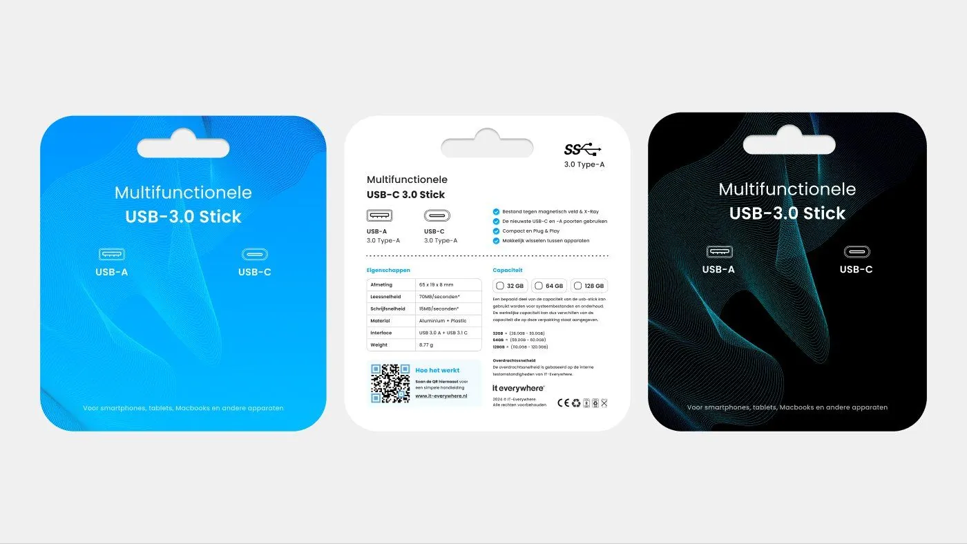
With flavours, scents and colours, the obvious route is a clear but controlled difference in colour. Not every variant needs a completely new design. It often works better when the basis stays identical and the variant layer changes recognisably in a fixed place. That way a customer sees straight away what is family and what is version.
With sizes, bundles or strengths, the emphasis is often less on atmosphere and more on clarity. There, a numerical indication, a fixed label zone or a clear hierarchy between product type and version can matter more than a big difference in colour. The goal stays the same: show difference where it is relevant for the choice, not everywhere at once.
The use of images should also change selectively. If every variant gets its own photography, illustration style or icon logic, a line can quickly fragment. It is better to decide in advance which visual layer carries the variant. Is it colour? Is it a flavour illustration? Is it a band, badge or panel? The less arbitrary that choice, the more easily the line stays scalable.
Many brands make the mistake here of wanting to add “something extra” per variant. Another pictogram, another colour, another claim. But every extra layer has to be read. Difference therefore works best when it sits exactly where the customer actually makes their selection.
How to combine recognition and distinction without pulling your brand apart
The tension between recognition and distinction is exactly where good variant packaging is decided. Too much recognition makes variants interchangeable. Too much distinction makes the line chaotic. The solution is not a middle way based on gut feeling, but a clear system that determines in advance what always stays the same and what is deliberately allowed to change.
A useful approach is to work in layers. The first layer carries the brand and the family. The second layer shows the product type. The third layer makes the variant visible. Once that order is right, a pack becomes quicker to scan. A customer then first sees that it is the same brand, then which product they have in front of them and only after that which exact version it is.
That helps not only on the shelf, but certainly online too. On product pages and in thumbnails you have little room to explain nuance. Packaging, product image and variant logic then have to support each other directly. For teams that want to sharpen that translation to e-commerce, product images for more conversion is the logical next read.
That is where variant logic ties in directly with eye-catching packaging in e-commerce, because recognition only really counts if it also holds up at a small size.
The difference between a messy line and a scalable line often comes down to a few fixed choices. Where does colour appear? How large may the variant name be? Which elements always stay at the top? How much space does the brand get? Once those rules are fixed, you can expand faster without every new product changing the whole system again.
The difference below shows clearly why some variant lines feel instantly understandable and others cause unnecessary mental noise.
| Element | Messy approach | Stronger approach | Effect on recognition or choice |
|---|---|---|---|
| Brand structure | Logo, typography and composition change per variant | Fixed brand structure across the whole line | Faster family recognition |
| Variant colour | Every SKU gets arbitrary use of colour | Colour difference sits in a fixed, recognisable place | Clearer distinction between variants |
| Product name | Product type and variant compete for attention | Product type first, then variant, in a clear order | Less confusion during a quick scan |
| Claims and badges | Every variant gets its own loose accents | Claims follow a fixed zone and fixed sizing | More calm and better readability |
| Expanding the line | New SKUs are designed ad hoc | New SKUs follow existing rules of play | Better scalability without visual chaos |
When packaging hierarchy helps with product families and ranges
Packaging hierarchy only becomes truly valuable once a range has to explain more than a single product. With product families, hierarchy helps determine what a customer should see first, second and third. That is not a theoretical exercise, but a practical way to make variants quicker to read.
In strong variant packaging, therefore, not everything sits at the same level. The brand does not need to shout as loudly as the flavour. The flavour does not need to be as large as the product type. And a claim does not need to take over the lead role when someone mainly wants to know which version they are holding. Good hierarchy makes that order visible.
For e-commerce this is extra important. In thumbnails, details disappear and mainly the main line remains. If the hierarchy is not right there, the pack quickly becomes vague at a small size. That is exactly why variant packaging should also be tested in grids and main product images, not just as a standalone design file at a large size.
This page therefore mainly looks at hierarchy within variants and product families. What matters most here is that this order helps keep a range understandable, recognisable and scalable.
Common mistakes with variant packaging
The first common mistake is too little difference. Flavours, sizes or versions then look so similar that customers have to hunt for small details to find the right variant. That slows down the choice and increases the chance of mistakes, especially online.
The second mistake is the opposite: too much difference. Every variant gets its own style, its own illustration, a different set of claims or a different composition. That seems creative, but it breaks down the family logic. The line then does not feel richer, but unstable. The brand has to be recognised all over again with every SKU.
A third mistake is difference in the wrong place. A detail that says little to the customer changes, while the truly decisive information stays too small or too subtle. For example, a large atmospheric element for the flavour, while size or strength barely stands out. A pack like that may look lively, but it does not help anyone choose.
Also common: too many claims, badges and secondary messages. Especially when a range grows, brands often pile extra communication on top of each other. The result is that the variant layer drowns among all the other signals. The pack is then full, but not clear.
Finally, things often go wrong in the connection with images. A variant line can seem logical in print, yet still collapse in packshots, thumbnails or gallery images. The system is then not wrong on paper, but too weak in the translation to e-commerce. That is why variant packaging should always be judged in the context in which customers really see it.
How to make packaging design scalable across product lines
Scalability does not start with more designs, but with better rules. A brand that expects to add extra flavours, formats or product families in the coming years gets little out of packaging that only works for the current four SKUs. You then need to know in advance which building blocks are fixed and which stay flexible enough for expansion.
A practical first step is to record a simple design set per family. Think of fixed zones for brand, product type, variant and claims. Also record how colour may be used, when images may change and which elements never change position or scale. That does not have to be a cumbersome manual. A compact set of decision rules often already prevents a lot of ad hoc work.
After that, it helps to design not just per SKU, but per line. Always look at new variants next to existing ones, not in isolation. Only then do you see whether the distinction is big enough, or whether it is out of step. That is also the moment to test how the series works in product grids, packshots and main product images.
For e-commerce it also pays to think about packaging and variant presentation together. When a customer compares several versions online, naming, colour differences, packshots and product page logic have to confirm each other. Otherwise one system corrects the other. That is exactly the difference between a neat line and a commercially strong line.
If that line then also needs to carry through into delivery and brand experience, improving the unboxing experience is the logical next read.
So if you make variant packaging scalable, you are building not only a more attractive range, but also a range that is quicker to manage. New products then add less chaos and more recognisable value.
Frequently asked questions
What is good packaging for product variants?+
Good packaging for product variants keeps the product family recognisable and at the same time makes clear which version someone has in front of them. The fixed part of the design stays stable, while relevant variant information changes visibly in a controlled way.
How do you prevent variants from looking too similar?+
By placing the difference in a fixed, clear spot in the design. Think of colour, variant name or a recognisable label zone that customers immediately link to flavour, size or version.
How do you prevent visual chaos in a product line?+
By not designing again for each variant, but working with fixed rules of play for composition, brand codes, product name and claims. New SKUs should fit into the line, not each start their own visual system.
When is packaging hierarchy important for variants?+
As soon as a customer needs to be able to compare several versions quickly. Hierarchy then helps to show brand and product type first and only then the specific variant. That makes choosing easier, especially online.
Should every variant get a different colour?+
Not necessarily. Colour is often a strong carrier of difference, but only if it is used consistently and functionally. Sometimes size, label structure or typographic distinction works better, depending on the product.
How do you know whether a variant line is ready for e-commerce?+
By judging the packaging not only as a design file, but also in thumbnails, product grids and main images. If variants stay quickly recognisable and easy to tell apart there, the line works much better for e-commerce. Want to sharpen that for your own range? Then book an introductory call.
Conclusion
Packaging for product variants only really works when recognition and difference do not fight each other, but reinforce each other. That takes more than attractive individual packs. It takes a system that keeps product families readable, distinguishes variants clearly and stops expansion from descending into visual chaos.
If you get that logic right, you make the range not only stronger for customers, but also more scalable for the brand itself. That is exactly why variant packaging is not a question of detail, but a strategic design choice within product packaging.

Melle Sikma
Helmsman
melle@brandmonks.nl