The psychology of price perception: why €49 works better than €50
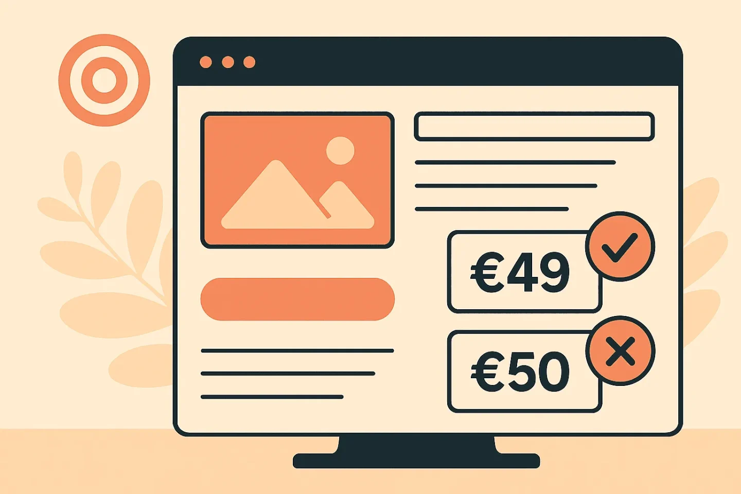
€50 or €49: the difference is one euro, but to your customer it feels completely different. Price psychology is not a gimmick. It affects your conversion. Hard.
Many e-commerce businesses think the lowest price delivers the most conversion. But that is too simplistic. Price perception (how a price is experienced, not what it objectively is) plays a much bigger role. You can sell more without lowering your price, purely through smarter presentation. In this blog we dive into the psychology of pricing: how do customers think, where do they drop off, and which tactics do work?
Table of contents
- Price is a feeling: how the brain and numbers clash
- The power of odd numbers and ‘cent effects’
- Context, anchors and relative value
- From price to trust: how visual presentation counts
- Conclusion
Price is a feeling: how the brain and numbers clash
Ask a customer: “Is €50 expensive?” and you will not get an objective answer. Price is rarely judged rationally. The brain processes price information quickly and superficially, based on emotion, reference and context. This is not an assumption. It has been proven time and again in behavioural research.
In *Thinking, Fast and Slow*, Daniel Kahneman describes how people use fast decision systems to judge prices. They round off, filter and compare based on the first number they see. A price of €49.95 feels “much less” than €50, even though the difference is negligible.
The mistake? Many web shops communicate price as if it is only about figures. But price is framing. And if you do not steer that consciously, you hurt your conversion without noticing.
The power of odd numbers and ‘cent effects’
One of the best-known techniques: charm pricing. Prices ending in .95 or .99. Does that still work? Yes, but only if you understand why. The effect comes from ‘left digit bias’: the first digit determines how cheap something feels. €49.99 feels like “in the forties”, while €50 is suddenly “fifty”. The brain registers the 4 instead of the 5, and that influences buying behaviour.
A/B test results from e-commerce platforms show this difference. In a test with identical products and only price variations, products priced at €9.99 performed up to 8.4% better than the €10 variant. The effect was strongest among new visitors and mobile traffic.
Odd numbers have psychological advantages too. They feel more ‘human’, less rounded and therefore less commercial. That lowers resistance. Compare: – €100 feels like a marketing price. – €97 feels like a calculated value.
Note: only use these tactics where they fit. Charm pricing works well for consumer products. But for high-end or B2B offerings it can actually undermine your positioning.
Context, anchors and relative value
The price your customer sees is rarely the first one they compare it with. Your visitor sees similar products, discount percentages, reference prices. Everything you show before or next to the actual price affects how it is perceived.
We call that anchoring. You set an ‘anchor’ for what something should cost, and your price comes out favourably or unfavourably against it. If you put a more expensive variant at the top first, the cheaper model below it feels more attractive. Not because it ís cheaper, but because it is being compared.
Smart application: – Show a premium product of €129 first – Then a standard model of €79 – The customer chooses €79 faster than if you show it as the only option
A similar effect works with struck-through prices. But be careful: too many fake “was/now” prices create distrust. Use real value anchoring: briefly explain why your offer is worth its price. And make sure the price context suits the target audience. Our conversion strategies use anchoring as a UX principle, not as a sales trick.
From price to trust: how visual presentation counts
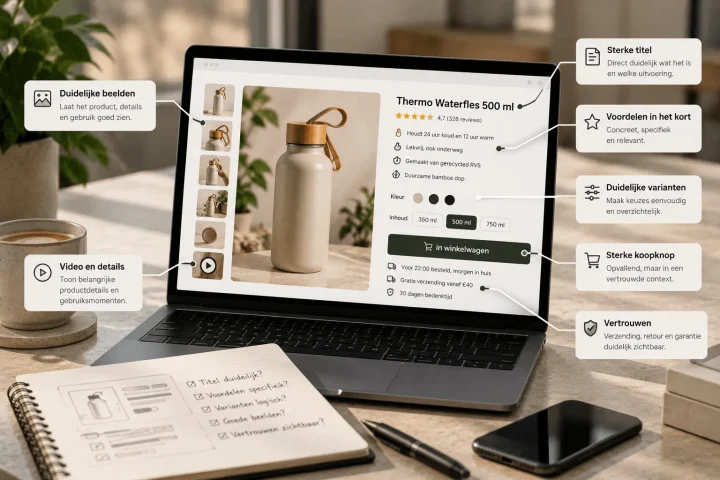
Price is not separate from design. A price can be exactly the same and still feel different, purely because of visual hierarchy, white space, use of colour or placement. Here are concrete UX tactics that positively influence your price perception:
- Small font size = lower price perception (especially for discount notices)
- White space around the price improves readability and trust
- Colour accents (such as green or blue) increase click-through on CTAs for offers
- Place the price close to the main benefit: this connects value and investment
And do not forget mobile. On smaller screens, the price is often the first thing in view. So make sure your mobile price is visually balanced: not too dominant, not hidden. Read more about visual hierarchy here.
Finally: price perception is about trust. If your pricing does not match your promise, people drop off. Or they click through to a competitor with less friction. So do not just test the price itself, but also how it is presented in text, images and context.
Conclusion
Price is never just a number. It is a psychological anchor, an expectation mechanism and a design decision all at once. By understanding how people experience prices, instead of just showing them, you can optimise without giving discounts. And that pays off. Literally.
Want to know how your web shop scores on price perception, or test which variant works best? We are happy to help. Take a look at our approach to conversion optimisation or ask for advice on your pricing UX.

Melle Sikma
Helmsman
melle@brandmonks.nl