Packaging that stands out in e-commerce starts with recognition
Packaging that stands out online doesn’t win because it shouts the loudest, but because a visitor understands in a fraction of a second which product they are looking at and why the brand feels different from the rest.
In e-commerce, standing out is therefore less a matter of decoration and much more a matter of recognition, calm and smart visual emphasis.
Many brands still judge packaging from a classic shelf logic. They think about how a product looks when someone physically walks past it, picks it up and looks at it up close. Online it works differently. On a product grid, category page or marketplace overview, packaging is usually seen small first. Sometimes in a thumbnail. Sometimes half in view. Sometimes next to ten almost identical competitors. Then what counts is not how many elements are on it, but how quickly a visitor picks up the right signals.
That is exactly why striking e-commerce packaging isn’t automatically busy, colourful or outspoken. Packaging can be visually strong and still look very controlled. The real question is whether the design builds recognition fast. Does someone see straight away what they are looking at? Does the brand stick? Does the product feel credible, attractive and professional? If it does, not only visibility goes up, but also the chance that someone clicks through.
At BrandMonks we therefore don’t see packaging as a separate print file, but as a commercial visual layer. Strong product packaging doesn’t only help at the moment of delivery. It already plays a part earlier in the funnel, in click value, brand recognition and the first online impression of a product.
Why standing out online takes something different from standing out on the shelf
In a physical shop, packaging competes with other packaging on the same shelf. Online, packaging competes with scrolling behaviour, small image areas, varying screen sizes and a visitor who decides in seconds whether something deserves attention. That difference is big. What feels beautiful, rich and layered in a shop can come across online as cluttered, flat or illegible.
On top of that, a lot of context is missing online. In a shop you can turn a product round, bring it closer and judge material or finish better. In e-commerce, much of that impression already has to come from the first image. That means shape, colour blocks, main contrast and recognisable brand codes become more important. A subtle design can be strong in real life, but disappear completely online if it has no clear visual anchors.
The setting is different too. On a category page your product isn’t viewed calmly on its own, but between other products, prices, stars and filters. On a product page, the packaging then has to work together with gallery images, USPs, title and variant choices. So the packaging doesn’t only have to stand out, it also has to move in step with the rest of the image logic. For teams who want to sharpen that broader role of product images, product images for more conversion is the logical next read.
Standing out online therefore calls for a different discipline. Less reliance on detail that only becomes visible later. More attention to immediate recognition, clear main lines and a design that still convinces at a small size. If you understand that, you don’t just design better-looking packaging, but packaging that works harder in e-commerce.
What makes packaging clickable in a web shop
Clickable packaging helps a visitor sense more quickly that a product deserves attention. That often starts with silhouette and main shape. If product packaging is immediately recognisable as a whole, it stands apart more quickly. Especially in categories where many products look alike, a strong visual language of shapes or a clear division of surfaces can already do a lot.
After that, colour and contrast play a big part. Not because everything has to be bright, but because the most important parts of the packaging must not disappear. A brand panel, product name, distinctive element or main illustration needs enough tension online to stay visible. Too little contrast makes a product anonymous. Too much contrast without hierarchy makes it busy.
The distribution of information also determines click value. Packaging with a clear main focus straight away feels more professional more quickly. Packaging on which brand, product type, variant, claim and image all ask for attention at once actually slows things down. Then a visitor has to work out what to look at first. In a fast web shop setting, you lose strength right there.
The question of what should be seen first is, at its core, a matter of packaging hierarchy.
So clickable doesn’t mean packaging has to be spectacular. It is often smarter to make a design visually tighter, so the most important thing comes forward more strongly. A simple but clear front often beats a rich design without a lead role online. You see that principle on product pages more broadly too: what is understood faster often converts better. For that broader decision logic, increasing product page conversion is the logical next read.
How packaging increases recognition on product pages and in thumbnails
Good packaging doesn’t just make a product look better, it also makes it recognisable faster across different touchpoints. A visitor sees a thumbnail on a category page, clicks through to the product page and then looks at larger images or detail shots. If the packaging keeps the same brand codes and main elements intact in all those stages, trust grows.
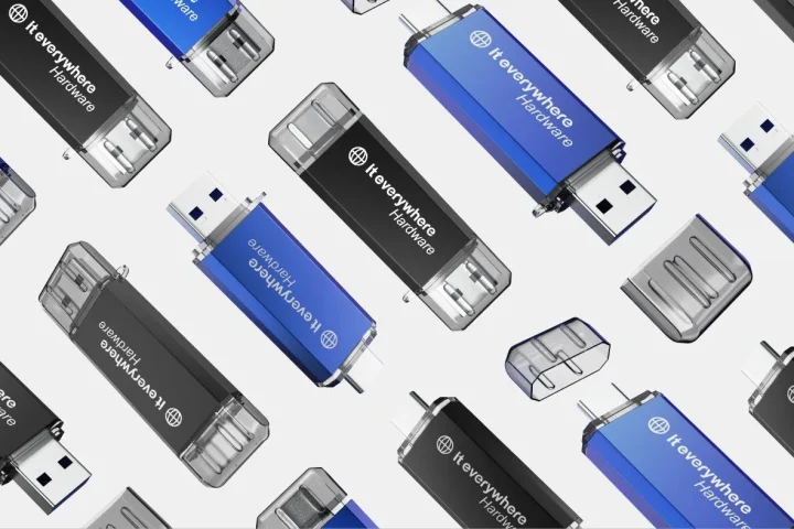
That recognition becomes extra important when the product itself is visually less distinctive. Think of supplements, personal care products, accessories or products with a similar shape. In cases like these, the packaging often becomes the primary anchor for recognition. Not because the contents are unimportant, but because online the packaging shows the first clear difference between options that would otherwise quickly start to look alike.
On product pages, that carries through into understanding. Packaging that clearly communicates which product, which variant and which positioning someone is looking at reduces doubt. The visitor then has less to puzzle over. You see that especially in grids, main images and variant overviews. When packaging, product title and image confirm each other, the page feels more logical and reliable.
Thumbnail impact goes hand in hand with this. Small images call for clear front panels, legible contrast and a design that doesn’t collapse as soon as details disappear. Not every element has to stay visible then. What matters more is that the overall picture still feels like the same brand and the same product family. If packaging only works up close, it leaves a lot of potential untapped online.
If you work with several flavours or versions, that recognition also has to hold up across the whole line. Then this topic ties directly into packaging for product variants.
How to combine striking design with clarity
Many packages don’t lose out online because they attract too little attention, but because they ask for attention in the wrong way. Everything is special. Everything wants to be visible. Everything has to explain at once what the product is, what the brand stands for and why the visitor should choose it. The result is then not a strong design, but visual friction.
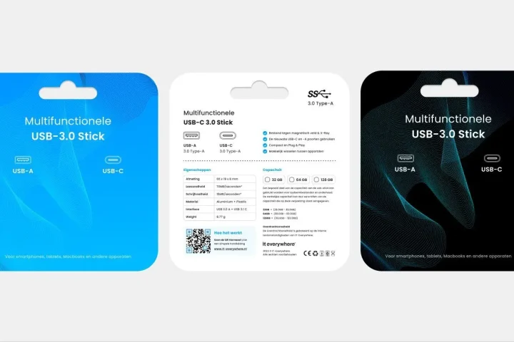
Clarity starts with dividing the tasks. What should someone see first? The brand. The product type. The variant. The main promise. Only when that order is right can striking design really work. Without that hierarchy you get packaging that has energy but no direction. That is exactly the point where striking design and e-commerce logic have to reinforce each other instead of working against each other.
Strong packaging design therefore consciously chooses what can be large, small, quiet or outspoken. Sometimes standing out comes from a powerful block of colour. Sometimes from a clear product name. Sometimes from a unique composition or a visual language that stays recognisable across a whole line. But however it is solved, the packaging has to stay clear within a few seconds for someone scrolling fast.
The difference below shows clearly why some packaging looks busy online and other packaging clicks better.
| Element | Messy approach | Stronger approach | Effect on clicks or understanding |
|---|---|---|---|
| Use of colour | Lots of loose accent colours without a main direction | One clear main colour block with targeted accents | Faster recognition and more calm |
| Brand mention | Logo competes with all other elements | Brand clearly in a fixed place with enough contrast | Brand sticks better in grids and thumbnails |
| Product name | Too small or spread across several panels | Product name immediately visible in a clear hierarchy | Faster understanding of the product |
| Variant information | Variant gets lost between claims and decoration | Variant gets a fixed, clear role in the design | Less confusion between versions |
| Image and details | Too many decorative elements at a small size | Fewer but stronger visual signals | Better legibility on product pages |
When packaging feels premium and when it just gets busy
A premium feel online rarely comes from adding more elements. It comes rather from control. Packaging feels premium when the proportions are right, the design looks confident and the most important signals don’t have to fight for attention. Calm is often a stronger premium signal than decoration.
That doesn’t mean premium always has to be minimalist. Some brands can look richer, warmer or more outspoken. But even then the packaging still has to stay credible on screen. If gloss, patterns, claims and decorative details take over the design, the sense of value actually disappears. Then something doesn’t feel more exclusive, but heavier and less sharp.
Here too, premium always needs to fit the brand. A luxury look that doesn’t suit the product, price point or target audience quickly feels forced. Simpler packaging can come across much more strongly online when it is clear, well finished and consistent. For brands, premium is therefore not just about aesthetics, but also about whether the packaging speaks the same language as the rest of the brand. That ties directly into branding and visual positioning.
What feels premium online also has to be lived up to later, in improving the unboxing experience.
Common mistakes in e-commerce packaging that wants to stand out
The most common mistake is thinking that striking automatically equals more. More colour, more claims, more shapes, more details. In reality, packaging often loses strength online as soon as it tries to do too much at once.
- A front without a clear main element
- Packaging that completely loses its legibility at a small size
- Variant systems in which colours or labels don’t differ enough
- Decorative details that make the product image more restless than necessary
- A premium look that doesn’t suit the product or price point
- Packaging that is disconnected from product photos, thumbnails and gallery logic
A second mistake is generic design. Packaging can be technically neat and still leave no impression. That happens when colour, typography and visual language feel interchangeable. Then a visitor does see a correct product, but not a brand they will recognise later. Online in particular, that is costly, because you have fewer touchpoints to build memorability.
Finally, things often go wrong in how the packaging connects to imagery. Packaging can be well designed in itself, but come across weakly in photography or listing images. Then the problem isn’t only in the design file, but in the translation to e-commerce. Standing out only really works when packaging and product image tell the same story together.
How to make packaging design stronger without overhauling your whole line
Not every improvement calls for a complete redesign. Many brands can already make their online packaging stronger by looking more sharply at a few recurring choices. What does someone see first? Which element should stick? Where does contrast disappear? Which variant is now too easily confused with another? Questions like these often deliver gains faster than designing again from scratch.
So start with visibility at a small size. Don’t just check the design file, but also thumbnails, product grids and the first main image on the product page. That is exactly where you see whether the packaging really works. A brand panel that needs to be a bit bigger. A product name that is too fine. A variant colour that is too subtle. A main element that needs more calm. Small changes can have a big effect online.
After that you can improve the line. Many e-commerce packages gain strength when brand codes are applied more consistently across several products. Not because everything has to be identical, but because a visitor sees connections faster. A fixed place for the brand, clearer variant logic and stronger main frameworks make a range more recognisable without each product losing its own character.
If you want to tackle this structurally, you don’t have to replace the whole system straight away. Often a targeted sharpening of visibility, hierarchy and image fit is enough to go from “neat” to “striking and clear”. That deliberately makes this page different from a general guide to packaging design: here it is not about more design, but about more visible design choices in e-commerce.
Frequently asked questions
What makes packaging clickable in a web shop?+
Packaging becomes more clickable when a visitor quickly understands at a small size what they are seeing and why the product deserves attention. Contrast, a recognisable shape, a clear product name and a strong main element usually play the biggest part.
How do you make packaging stand out in e-commerce without it getting busy?+
By choosing one clear visual lead role instead of many loose accents. Packaging stands out more strongly online when brand, product and variant have a clear order and don’t all ask for attention at once.
Does striking packaging also work on product pages?+
Yes, provided it doesn’t just look good but also helps recognition and understanding of the product. On product pages, packaging should support the images, title and variant information instead of adding extra confusion.
When does packaging feel premium online?+
Online, packaging feels premium when the design comes across as controlled, calm and credible. Premium usually lies more in proportions, the impression of material and hierarchy than in as many decorative details as possible.
Which packaging works well in thumbnails?+
Packaging with a clear shape, a recognisable block of colour and a strong front usually works better in thumbnails than packaging that relies entirely on small text or subtle details. The overall picture has to hold up at a small size too.
How do you improve e-commerce packaging without a complete redesign?+
Start with the online visibility of your current packaging. Look at thumbnails, main images, distinction between variants and brand recognition. Targeted changes in contrast, hierarchy or consistency across the line often already deliver a lot. Want to translate that into concrete steps for your own line? Then book an intake call.
Conclusion
Packaging that stands out in e-commerce doesn’t win by being the loudest, but by being recognised faster, understood better and feeling more professional on screen. Online in particular, that is the difference between a product that is merely visible and a product that really holds attention.
That is why strong packaging design in e-commerce is always more than decoration. It is a combination of recognition, clarity, a premium feel and image fit. Want to use that layer more smartly for your own range? We are happy to help you think about stronger product packaging.

Melle Sikma
Helmsman
melle@brandmonks.nl