Increasing conversion in your web shop: from more visitors to more customers
Increasing the conversion of a web shop starts with removing doubt and unnecessary obstacles during the buying process. Provide clear product information, convincing product images, visible benefits, enough trust and a simple checkout. By testing improvements systematically, you get more revenue out of your existing website traffic without spending extra ad budget straight away.
Many web shops focus mainly on attracting more visitors. They invest in SEO, social media, Google Ads and marketplaces, but once on the website, a large part of that traffic is not turned into orders. Visitors hesitate, cannot find enough information or get stuck during checkout.
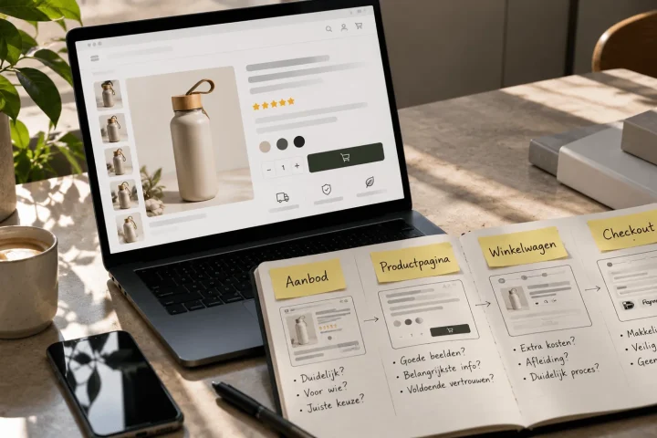
So increasing web shop conversion is not about one clever button, eye-catching colour or temporary discount. It is about the whole customer journey: from the first point of contact to placing the order. Every unclear point, delay or missing reassurance can make a potential customer drop off.
What to remember above all
The most important parts of a web shop that consistently turn more visitors into customers.
- Make the value and benefits of each product clear straight away
- Remove doubt with reviews, guarantees and transparent information
- Improve based on data and test one change at a time
Why visitors leave your web shop without ordering
Visitors usually leave a web shop because the value of the product is not clear enough, there is not enough trust or the buying process takes too much effort. Unexpected delivery costs, unclear delivery times, slow pages and missing product information can also block a purchase. Conversion optimisation therefore starts with finding out the main doubts and drop-off points.
A visitor decides within a short time whether a web shop is relevant and trustworthy enough. If it is not immediately clear what you sell, who the product is for and why someone should order from your web shop, the chance of them dropping off goes up.
Visitors do not only judge the product. They also judge the professionalism of the web shop, the brand, the delivery terms and the perceived risk of the purchase. A website that works well technically can therefore still convert poorly if the presentation does not convince.
Common conversion leaks are:
- An unclear proposition on the homepage.
- Product pages with too little or too general information.
- Images that do not show the use, size or benefit.
- Unexpected delivery costs at the end of the checkout.
- A complicated ordering process with too many fields to fill in.
- Missing reviews, returns policy or contact details.
- A mobile web shop that is slow or cluttered.
Before you add new features, it is wise to solve these fundamental blockers first. A simpler and clearer web shop often converts better than a busy website with lots of animations, pop-ups and distracting elements.
Make it clear straight away why visitors should order from you
A strong web shop proposition tells visitors immediately what you sell, which customer it is for and what advantage you offer over the alternatives. This message needs to be visible at the top of the homepage and key landing pages. Avoid general claims and name concrete benefits, such as fast delivery, specialist advice, unique product quality or a wide range.
Many web shops use general copy such as “the best quality”, “excellent service” or “everything for your situation”. Statements like these say little as long as they are not backed up. Visitors want to know what concretely makes your offer better, easier or more reliable.
An effective proposition usually has three parts:
- The offer: what exactly do you sell?
- The result: what problem does the product solve?
- The proof: why can the visitor trust your promise?
Support the main message with a clear call to action. Use buttons that say what happens after the click, such as “View the collection”, “Find your size” or “View all models”. A vague button text such as “More information” gives less direction.
Optimise product pages for certainty and persuasion
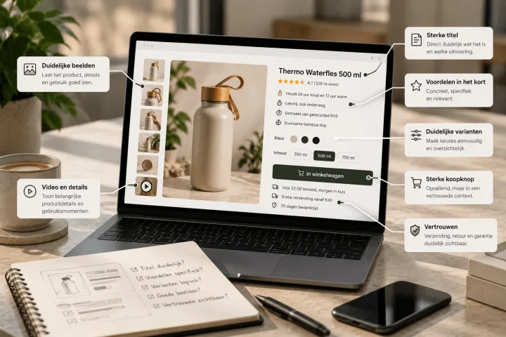
A converting product page answers the most important questions before the customer has to ask them. Combine clear product images with benefits, specifications, use cases, reviews, delivery time and returns information. Do not only show what the product is, but above all why it suits the visitor’s situation.
For many web shops, the product page is the most important moment of decision. A visitor compares the product with alternatives and tries to judge whether the purchase will live up to expectations. Missing information increases the risk that the visitor leaves the page to keep looking elsewhere.
Sell benefits instead of just specifications
Specifications matter, but they do not always convince on their own. So translate technical features into benefits for the user.
A battery life of ten hours, for example, is a product specification. That someone can use the product for a full working day without recharging in between is the matching benefit. By combining both, the customer immediately understands why the feature is relevant.
Use product images that answer questions
Good product images show more than just a cut-out product on a white background. Use different types of images to explain the product fully:
- A clear main image.
- Detail images of material and finish.
- A lifestyle image in which the product is being used.
- An image with dimensions or scale.
- An overview of the main benefits.
- A comparison with other models or variants.
Visitors cannot hold or try out a product online. The visual content therefore has to take away part of that uncertainty. Professional product photography, 3D renders and converting listing images can make a big difference here.
Put important information above the fold
The most important buying information must be visible without someone having to scroll a long way first. Think of:
- The product title.
- The price.
- The main benefits.
- Available variants.
- The current delivery time.
- The order button.
- The average review score.
Detailed technical information, manuals and further explanation can go lower down the page. The first view should mainly help the visitor understand quickly whether the product meets their need.
Increase trust in your web shop
You increase trust with recognisable contact information, real customer reviews, transparent delivery terms, secure payment methods and a clear returns policy. Place this reassurance close to key moments of decision, such as the order button and the checkout. Trust elements work best when they are specific, verifiable and relevant.
A visitor who does not know your brand yet subconsciously looks for signals that confirm ordering is safe. Especially with more expensive products or unknown web shops, doubt can have a big influence on conversion.
So show that there is a real organisation behind the web shop. Give a phone number, email address, company address and registration details. Also add an accessible about-us page with information about the company, the people and the way you work.
Use reviews in the right places
Reviews are not just meant for a separate review page. Show the average score on category and product pages too. For key products, also include detailed reviews in which customers explain how they use the product and what result they get.
Relevance matters more here than just the number of stars. A review in which a customer answers a common doubt can be more convincing than a short comment that just says “good product”.
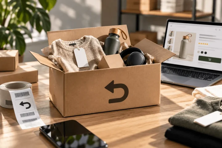
Be transparent about delivery and returns
Uncertainty about delivery costs, delivery time and returns terms can hold back an order. So do not wait until the end of the ordering process to show this information.
Before the product is added to the basket, communicate:
- When the product will be shipped.
- What the delivery costs are.
- How long the returns period is.
- What the conditions for returns are.
- Which guarantee applies.
Clarity prevents disappointment and lowers the perceived barrier to placing an order.
Simplify the basket and checkout
An effective checkout has as few steps, fields and distractions as possible. Preferably let customers order without a mandatory account, show the total costs early on and offer familiar payment methods. Every extra action can create a new drop-off point.
When someone adds a product to the basket, the purchase is not yet complete. The basket and checkout have to hold on to the conviction that has been built up and guide the customer to payment without unnecessary interruptions.
So take a critical look at which information is really necessary. Do not ask for details that are not needed to process the order. A mandatory account, a long form or unclear error messages can make a motivated customer leave after all.
A user-friendly checkout includes, among other things:
- A clear overview of the chosen products.
- The total price including delivery costs.
- The expected delivery date.
- An option to check out without an account.
- Well-known and relevant payment methods.
- Clear error messages for incorrectly completed fields.
- A clearly visible button to complete the order.
During checkout, remove as much distraction from the navigation as possible. The main task at that moment is completing the order, not browsing extra categories or blog articles.
Optimise your web shop for mobile visitors first
A mobile web shop has to load fast, be easy to use and show all the important buying information clearly. Provide buttons that are big enough, short forms, readable text and an order button that stays easy to reach. Check every optimisation on a real mobile device, not just in a shrunken desktop window.
On a smartphone there is less space, and anything unclear shows up faster. Complicated navigation, buttons placed close together or product images that are too small can make the user experience worse straight away.
With mobile optimisation, pay particular attention to:
- A clear menu with obvious categories.
- A search function that works well.
- Filters that are easy to open and apply.
- Product photos you can zoom in on.
- A visible, easy-to-reach order button.
- Payment methods suited to mobile use.
- Forms that automatically open the right keyboard.
On long product pages, a sticky order button can help keep the main action within reach. Do make sure it does not take up too much screen space or block other information.
Improve speed without losing the product experience
A fast web shop reduces frustration and makes it easier to view and order products. Optimise images, limit unnecessary scripts and remove apps that add hardly any value. At the same time, keep enough image quality to present the product professionally and convincingly.
Over time, web shops often get heavier and heavier. Chat widgets, review tools, tracking codes, pop-ups, animations and marketing apps get added. Every addition can affect the loading time and stability of the website.
So check regularly which features actually contribute to revenue or ease of use. An app that is hardly used but loads scripts on every page is better removed, or switched on only on relevant pages.
With images, balance matters. Files that are too large slow the website down, while images that are compressed too much reduce the professional look. Use modern file formats, suitable image dimensions and lazy loading for images that are not immediately in view.
Make the offer more relevant to every visitor
Relevance increases the chance that a visitor finds a suitable product faster. Use logical categories, clear filters, relevant recommendations and information that matches different use cases. Personalisation does not have to be complicated: a good product structure and targeted choice guidance can already remove a lot of doubt.
A large range offers choice, but can also cause choice overload. So help visitors compare and select. Do not only show which products are available, but also explain which model best suits a specific situation.
You can do this with, among other things:
- A product comparison tool.
- A choice guide or short quiz.
- Filters on properties that matter to customers.
- A size chart or configurator.
- Recommendations based on the product being viewed.
- Bundles with logically matching items.
Avoid random recommendations. A “You might also like” block adds little value if the products shown do not logically match the buying intent.
Step-by-step plan to increase your web shop’s conversion
Start conversion optimisation by collecting data, then identify the main bottleneck and formulate a concrete hypothesis. Apply one improvement, measure the effect and use the outcome for the next optimisation. Setting priorities prevents loose changes being made without a demonstrable result.
Step 1: collect behavioural data
Do not only look at the overall conversion rate, but also analyse where in the customer journey visitors drop off. Compare devices, traffic sources, landing pages and product categories.
Combine numerical data with behavioural signals, such as searches within the web shop, frequently viewed pages, abandoned baskets and questions to customer service.
Step 2: identify the biggest blocker
Work first on the problem with the biggest expected impact. If many visitors view a product but hardly anyone adds it to the basket, the problem probably lies on the product page. If baskets are filled well but orders are not completed, the checkout deserves priority.
Step 3: formulate a hypothesis
Describe what you want to change and why you expect it to deliver results. For example:
If we show the delivery time and returns terms directly below the order button, we expect more visitors to add the product to the basket, because an important uncertainty is removed earlier.
Step 4: test one change at a time
If several elements are changed at the same time, it is hard to tell afterwards which change caused the result. So preferably test one clear hypothesis per experiment.
Step 5: document the results
For each change, record the reason, hypothesis, duration and outcome. A test without a positive result also provides valuable information. This approach prevents old ideas being carried out again later without any justification.
Common mistakes in conversion optimisation
Many web shops focus too quickly on colours, buttons and small design details, while bigger problems in the proposition, product information or checkout remain. Other mistakes are testing without enough data, making too many changes at once and optimising based on personal preference instead of customer behaviour.
A more eye-catching order button can help, but it does not resolve fundamental doubt about the product. So do not automatically start with cosmetic changes. First find out whether visitors understand what the product delivers and whether they have enough information to make a decision.
Also avoid treating every change as an improvement. A more modern design is not automatically clearer, and more information is not always more convincing. Every addition must have a concrete function within the customer journey.
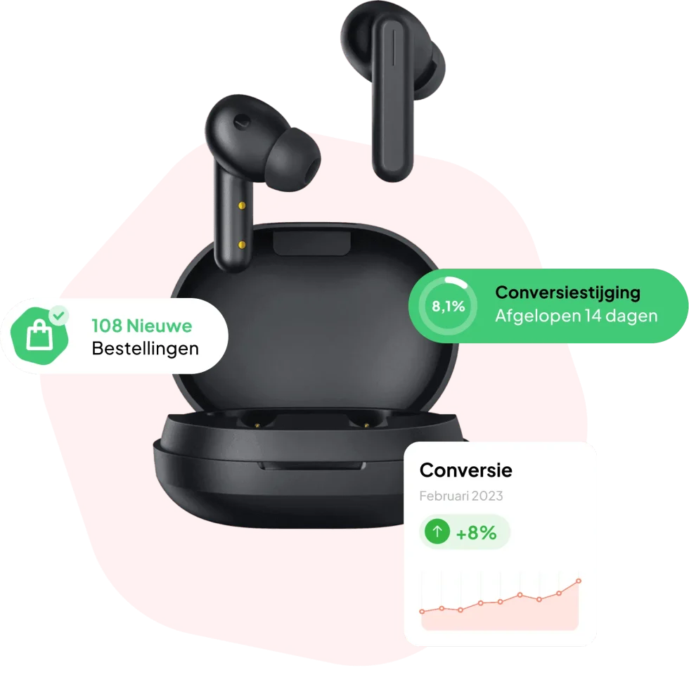
Another mistake is looking only at the conversion rate. An increase in the number of orders is positive, but also check the average order value, returns, margins and the quality of the orders. An aggressive discount can raise conversion temporarily, but lower profitability at the same time.
The role of content and design in higher conversion
Content and design determine how quickly visitors understand a product and how much confidence they have in the purchase. Good design creates hierarchy, while converting content covers benefits, use cases and possible objections. Both have to work together to guide the visitor towards a decision.
Conversion-focused design is not the same as adding as many eye-catching elements as possible. The aim is actually to create calm, recognition and direction. The visitor should understand without searching what is important and which next step is logical.
In web shops with many products, inconsistency also creeps in quickly. Product pages differ in image quality, text structure and level of information. Working with fixed formats and scalable templates makes it easier to present every product in a comparable and convincing way.
BrandMonks helps brands and web shops with converting product content, product images, listings, web shops and scalable content systems. This makes marketing, design and e-commerce fit together better.
Frequently asked questions about increasing conversion in a web shop
What is a good conversion rate for a web shop?+
A good conversion rate differs by industry, product price, traffic source and type of customer.
So do not compare your web shop only with a general average. Look mainly at your own development, performance per device and the difference between new and returning visitors. With a lot of traffic, even a small improvement can have a big effect on revenue.
How can I increase my web shop’s conversion quickly?+
Start by clarifying delivery times, delivery costs, returns terms and the main product benefits.
Also check whether the order button is clearly visible and whether customers can check out without a mandatory account. These improvements remove common doubts and obstacles without the whole web shop having to be redesigned.
Which pages matter most for conversion optimisation?+
The most important pages are usually product pages, category pages, the basket and the checkout.
Which page gets priority depends on visitor behaviour. Analyse where the biggest loss occurs. For some web shops the problem already lies on the homepage, while other web shops mainly lose orders during checkout.
Do reviews help increase conversion?+
Reviews can reduce doubt and show that other customers have had positive experiences with the product or the web shop.
Show reviews close to key moments of decision and preferably use detailed experiences that answer common customer questions. Make sure reviews are credible, current and relevant.
Should I have my web shop completely redesigned?+
A complete redesign is not always needed to increase conversion.
Targeted improvements to the proposition, product pages, navigation and checkout can already have a lot of effect. A new design mainly makes sense when the technical foundation, brand presence or usability falls short structurally.
How do I measure whether a change works?+
Measure a baseline beforehand and compare it with the performance after the change.
Look at the conversion rate, the percentage of visitors who add products to the basket, the number of completed checkouts and the average order value. With enough traffic, use an A/B test to compare variants fairly.
Consistently more revenue from your existing web shop traffic
Increasing the conversion of a web shop calls for a combination of clear communication, convincing product content, trust, ease of use and structured analysis. The aim is not to put visitors under pressure, but to remove uncertainty and make the buying process as logical as possible.
Start with the biggest blockers in the customer journey. Make the proposition clear, improve the information on product pages and check that ordering is easy on a mobile phone too. Then make sure delivery times, delivery costs, reviews and returns terms are visible at the right moment.
Conversion optimisation is not a one-off project. Customer behaviour, the range and the competition keep changing. By measuring results, recording improvements and continually testing targeted hypotheses, you build a web shop that not only attracts more visitors, but also turns more and more of them into customers.

Melle Sikma
Helmsman
melle@brandmonks.nl