The quiet power of scanning behaviour: why users don’t really read your website
You invest in strong copy, but your visitor scans. Doesn’t read. That difference determines your conversion.
People use websites differently than many companies think. Instead of reading calmly, they scan. Headings, buttons, words that stand out. Everything in between is often ignored. A strong design takes that into account. In this blog we explain how scanning behaviour works and how to adapt your website to it, without losing your message.
Table of contents
- What exactly is scanning behaviour?
- The impact on web design and copy
- Practical changes for scannability
- What we learn from behaviour tools
- Conclusion
What exactly is scanning behaviour?
Users don’t follow a linear path from A to Z. They jump. Their eyes look for headings, lists, buttons or visual anchors. The top of the page usually gets looked at, but actually reading paragraphs rarely happens.
That doesn’t mean content is unimportant. It means form has to support content. Poorly structured content gets ignored, however good your message is.
The impact on web design and copy
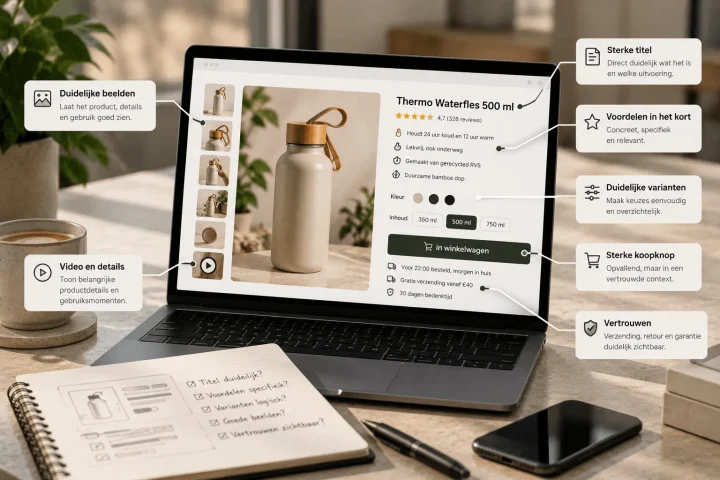
If users scan, your site has to make that easy. Think of clear subheadings, an airy layout and blocks of text with breathing room. The visual hierarchy should make it clear at a glance where you are and what matters.
Microcopy plays a part too. Small bits of text that give context or prompt action work better than long explanations. Our approach to UI/UX design takes this behaviour pattern into account, so users take action faster.

Practical changes for scannability
You don’t have to overhaul your entire website to make it more scan-friendly. Often it is the small changes that make the biggest impact:
- Use a clear visual hierarchy in headings, subheadings and calls to action.
- Avoid long paragraphs and break complex content into blocks of no more than four lines.
- Give buttons colour, space and a clear instruction, so no “click here”, but “view service”.
Want to know more? Take a look at our services page for websites, where this design principle is applied as standard.
What we learn from behaviour tools
Click maps, scroll maps and session recordings show exactly where users stop, click or drop off. Tools such as Hotjar or Microsoft Clarity show that users often decide within 3 seconds whether to stay or not.
Use these insights to put your most important messages, buttons and visual cues in view straight away. Scanning behaviour leaves little margin for error.
Conclusion
Once you know people scan, you design differently. You don’t just put text online, you structure it. You don’t write for yourself, but for an impatient visitor who wants to understand quickly what you offer. Adapt your site to that, and you’ll notice that not only your conversion rises, but trust does too.
Want to know how scan-proof your website is? Get in touch for a UX audit or a tailored design plan.

Melle Sikma
Helmsman
melle@brandmonks.nl