The psychology of the click: how to win buyers over
A visitor clicks on your product. They look at the images, scroll for a bit and… click away. No purchase. The product is good, the price is sharp. What went wrong? The answer is not in your product, but in the psychology of your presentation.
Let’s break a stubborn myth. A successful product listing is not a collection of loose images, it is a carefully directed route of persuasion. Every pixel has to serve a purpose. The purpose? Winning trust and guiding the customer to the buy button. Many business owners focus purely on ‘nice pictures’, but forget the two fundamental psychological pillars that we apply as standard. The first is visual hierarchy, which creates calm and clarity. The second is social proof, which removes doubt and builds trust.
Contents
- Your product is not the only factor
- Visual hierarchy as a guide for the eye
- Why customers believe other customers
- A review is more than just text
- How a logical structure builds trust
- The subtle power of colour and typography
- Conclusion: are you an architect or a bricklayer

Your product is not the only factor
The hard truth is that customers do not judge your product purely on specifications. They judge the overall presentation. A cluttered, unprofessional listing subconsciously raises the question of whether the web shop can be trusted. Before a customer has read a single word, their brain has already passed judgement based on the visual impression. Data from heatmaps shows exactly where that first impression goes wrong. Investing in professional design is therefore not a cost, it is an investment in credibility and trust.
Visual hierarchy as a guide for the eye
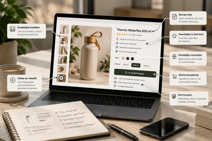
So what does visual hierarchy mean? Simply put, it is the art of guiding. You decide in which order the customer takes in information. This matters a great deal, because we know that users scan your page rather than read it. By playing with size, colour, contrast and white space, you steer attention to what really matters. The title should stand out most, then the USPs. Many listings scream for attention. Everything is equally important, so nothing is important. A good Bol.com listing applies deliberate guidance, so the customer effortlessly scans and understands the main benefits.
Why customers believe other customers
As a seller you can shout as loudly as you like that your product is great, but it remains a commercial message. Who does the customer believe straight away? Other customers. That is the core of social proof. A positive experience from an independent third party is infinitely more powerful than the best marketing copy. It lowers the threshold to buy because it creates a feeling of safety. ‘If it worked well for them, it will probably work well for me too’. It is a fundamental human principle that in e-commerce translates directly into conversion.
A review is more than just text
Most web shops hide their reviews somewhere at the bottom of the page in a standard format. A shame. We go one step further by turning the best reviews into a complete listing image. Why? Because people are visually wired. It is in effect a mini infographic of trust, strategically placed to stand out straight away. A powerful quote, combined with a 5-star rating, is immediately visible proof, even before the customer scrolls to the review section. This is just one of the many tips for improving your product images.
How a logical structure builds trust
Visual hierarchy and trust are directly connected. A design that is calm, logical and predictable feels professional. It shows that thought has gone into the user experience. Chaotic designs with changing fonts and loud colours do the opposite. They create cognitive friction and feel amateurish, which reflects directly on the trust in your product and brand. A consistent, strong visual identity is therefore not a luxury, it is a basic condition for success online.
The subtle power of colour and typography
Applying visual hierarchy is all in the details. Choosing a bold, clear font for a title and a lighter, smaller font for the description is a conscious choice. Using one or two accent colours from your brand identity to highlight important elements is a strategic decision. Together, these elements create a coherent whole that is easy to ‘scan’. The systems and templates we develop are built on these principles and help you apply these choices consistently and correctly.
Conclusion: are you an architect or a bricklayer
A bricklayer stacks bricks. An architect designs a building people want to be in. Apply the same principle to your product listings. Are you just stacking some pictures, or are you designing a persuasive route for your customer? By putting the psychology of visual hierarchy and social proof at the centre, you become an architect. You are not just building a listing, you are building a conversion machine. Want us to be the architect for your brand? Then get in touch with us.

Melle Sikma
Helmsman
melle@brandmonks.nl