Presenting variants on a product page: why unclear choices cost you conversion straight away
A variant only works well on a product page when a visitor immediately understands which version they are looking at and which alternatives make sense.
Strong variant presentation reduces the mental effort around colour, size or version and makes choosing noticeably easier.
Many product pages lose conversion as soon as variants no longer feel like a buying aid, but like an extra puzzle. Then a visitor doesn’t know whether they are looking at the right colour, whether a size is still in stock, whether a price difference means anything and what exactly changes when they click another option. At that moment, attention shifts from buying to figuring things out.
That is exactly why variant presentation is more than a technical selection field. It is a key part of product communication. A good variant set-up helps a visitor understand faster what their options are, which choice suits them and what they get once they select. As soon as that logic is missing, you get friction, choice stress and procrastination.
For BrandMonks this is no small UI/UX design detail. Variants touch directly on image, price, title, structure and consistency across product families. In this guide we show how to present variants logically on a product page, how to prevent choice stress and when to keep variants on one page or split them up instead.
Why many product variants cause unease instead of clarity
Variant problems usually don’t arise because there are too many options, but because the relationship between those options remains unclear. A visitor may see several colours, sizes or versions, but doesn’t immediately understand what the difference is, which selection is active and what changes after a click. Then a product page becomes less a place to decide and more a list of loose possibilities.
You often see this with colour variants without a clear image, size variants without context, flavour variants without a logical order or selectors in which different types of choice are mixed together. If colour, size and content are presented the same way while in practice they work very differently, confusion follows. The system is then technically complete, but mentally illogical.
Inconsistency also makes variants feel restless. The title doesn’t change along with the selection, the price shifts but without explanation, or the image stays the same while the selected version should visibly look different. As a result, the visitor has to check for themselves whether the page still matches what they chose. That kind of checking takes energy and lowers trust.
What a visitor needs to understand straight away with variants
With variants, a visitor first and foremost wants to know three things quickly. Which variant is selected now. Which other options are available. And what changes if I choose a different variant. If a product page doesn’t answer those three questions right away, every following choice becomes slower.
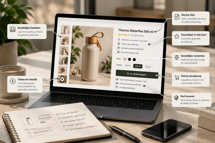
That is why variant presentation shouldn’t just be visible, but should also confirm. The current selection has to be recognisable in the selector, but also come back in the title, price, image or summary where relevant. A visitor shouldn’t have to wonder whether they are still looking at the same version they just chose.
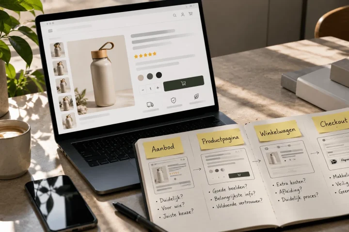
On top of that, the difference between variants has to be quick to scan. Not every variant needs a full explanation, but the logic does need to be clear. Is this difference mainly visual, functional, price-related or about content? The sooner that is clear, the less figuring out the visitor has to do themselves. For the broader decision path on the page, increasing product page conversion is the logical next read.
How to present colour, size and flavour variants logically
Not every kind of variant calls for the same form of presentation. That is exactly why variants on product pages often go wrong. A colour variant is visual. A size variant is usually functional and calls for fit, dimensions or availability. A flavour variant is more about content, preference or use. When you push all those types of choice into exactly the same UX, you lose nuance.
Colour variants usually work best when the visitor immediately sees what the chosen colour looks like. That can be done with swatches, clear labels and a main image that changes along with the selection. A colour selector without visual confirmation quickly feels abstract, especially for products where colour strongly affects their appeal. If several shades look alike, the difference has to be made extra clear in text or image.
Size variants usually need more context than colour. Here a visitor wants to know faster what fits, what is available and how a size relates to the other options. A dry list of S, M, L or numbers is often not enough. That is why size variants work better when they are supported by size information, a short clarification or a logical order from small to large.
With flavour, content or configuration variants, the question is different again. Here a visitor mainly wants to know what they are choosing in terms of content. Then a clear name, a short explanation and sometimes price or content differences matter more than a strong visual difference. So variant presentation only becomes truly logical when you choose, per type of variant, which form of information fits best.
How to make a variant selector clearer
A good variant selector doesn’t just show that there is a choice, it also makes that choice easy to understand. That starts with clear labels. A selector with only technical codes, abbreviations or internal terms slows the decision down immediately. The naming has to be instantly understandable to a visitor, without them needing extra product knowledge.
After that, order plays a big part. Colours, sizes and versions should be arranged logically. Not at random, not in internal database order, but in a way that feels predictable. Sizes ideally run from small to large. Configurations go from light to heavy or from basic to extended. Colours can be clustered by recognisability or visual similarity. A logical order immediately reduces mental noise.
Availability should also be clear in the selector. An option that can’t be delivered doesn’t always have to disappear. In many cases it is even better to keep unavailable variants visible, as long as the status is clear. That stops visitors wondering whether a size or colour exists at all. The page does then have to show straight away that the variant is temporarily unavailable and what the alternatives are. If the selector is clear but sits too late or too scattered on the page, product page structure for e-commerce is the logical next read.
How to make differences between variants visible with text, image and price
A variant choice only feels certain when the page confirms what has changed. Sometimes that is mainly an image change. Sometimes a price difference. Sometimes a different product title, short description or content indication. The bigger the difference between variants, the more important that confirmation becomes.
With visual differences, the image should change along with the selection whenever that is relevant. A colour variant without a matching image feels incomplete. With functional differences, it is the explanation that should change. Think of a different content, size, compatibility or bundle make-up. And with price differences, the visitor should be able to see quickly why the price changes and what they get extra for it.
This is exactly where variant presentation and product images meet. An image that changes with the selection reduces doubt, but only if it actually adds information about the selected variant. For the broader image logic, product images for more conversion is the logical next read. On this page it is mainly about when a variant needs visual confirmation and when text or price information is enough.
A short explanation can also do a lot. A variant such as 500 ml versus 1000 ml doesn’t have to sit only in the selector. A short benefit line or content clarification helps the choice land faster. Not everything has to be shown large, as long as the difference isn’t hidden.
How to prevent choice stress on a product page
Choice stress doesn’t only arise when there are many options, but mainly when the visitor doesn’t feel a clear route through those options. A product page with many variants can work perfectly well, as long as the logic stays clear. A product page with few variants can still feel restless if the choices are poorly explained.
The first step is prioritising. Not every choice deserves the same attention at the same moment. A product page should make clear which choice is relevant first. For a shirt, colour is often visible before size, but for a technical product, configuration may matter more than colour. As soon as the order of choices matches how people decide, the pressure drops.
The second step is reducing doubt. That means: no duplicate choices, no unclear labels, no hidden price differences and no image that doesn’t match the chosen variant. The fewer checks the visitor has to carry out themselves, the lower the perceived complexity. Variant presentation then becomes not an obstacle, but a form of guidance.
When you need visuals per variant and when you can share images
Not every variant needs its own complete image set. Sometimes it is vital, sometimes unnecessary. The key question is always: does the variant change something that is visible to the buyer or that decides the choice? If the answer is yes, that variant usually needs visual confirmation. If the answer is no, images can often stay shared.
Colour variants almost always call for their own visual support, because the difference is directly visible and relevant to the purchase. With size variants that is usually less necessary, unless fit, proportion or perceived shape really change too. With flavour or content variants it depends on packaging, labelling and context of use. With technical configurations, an extra visual is sometimes less important than clear differences in specification.
Too many unique images per variant make management heavier than necessary. Too little visual differentiation makes the choice unclear. That is why a shared base set often works well, supplemented with variant-specific images where the difference really needs to be felt. That makes the product page not only stronger, but also more scalable across product families.
When to keep variants on one product page and when to create separate pages
Not every variant automatically belongs on a single product page. Sometimes that works excellently, sometimes it doesn’t. The right choice depends on how big the difference between variants is and how much overlap remains in product promise, use, image and content. Variations that mainly differ in colour, size or a limited version can often stay on one page just fine.
As soon as variants diverge too far in content, a single page becomes unclear more quickly. Think of large price differences, different use cases, strongly differing specifications or visuals that almost feel like a different product. Then a visitor has to switch too much within one page, and the variant logic loses its strength. At that point a separate product page can make more sense.
A practical rule of thumb is therefore: keep variants together if the main choice stays the same, and split them as soon as the buying question changes fundamentally. If someone choosing between two versions is in fact deciding between two different situations of use, one product page is often too tight. If the variants are mainly different versions of the same core product, bundling them often works better.
For teams with larger ranges, this is also a management question. A clear variant rule per product type prevents arbitrariness. Then you don’t decide ad hoc per SKU whether something gets its own page, but work from fixed decision logic. That in turn ties in logically with scale and repeatability within the range.
Comparison: messy variant presentation versus clear variant logic
The difference below shows clearly why some product pages with variants feel calm and others cause friction.
| Element | Messy variant presentation | Clear variant presentation | Effect on understanding and conversion |
|---|---|---|---|
| Current selection | Unclear which variant is active | Active variant immediately visible and confirmed | Less doubt about what has been chosen |
| Differences between options | Variations only appear in a selector | Differences become visible in image, text or price | The choice feels more concrete and is quicker to understand |
| Variant selector | Random order and unclear labels | Logical order with clear names | Less searching and fewer mistakes |
| Availability | Undeliverable options disappear or are vague | Unavailable variants stay visible with a clear status | Less confusion about what does and doesn’t exist |
| Images | No or incorrect image change per variant | Images change where the difference is relevant | More trust in the chosen version |
| Product page structure | Variation feels like extra complexity | Variant logic supports the decision path | Less choice stress and a higher chance of purchase |
Frequently asked questions about presenting variants on a product page
How do you show variants on a product page without confusion?+
By making clear straight away which variant is active, which other options are available and what changes with a different choice. Title, image, price or summary should change along with the selection where needed.
What is the best way to show colour variants?+
With a clear colour selector and visual confirmation. If colour plays a visible part in the purchase, the main image or gallery should also match the chosen variant.
How do you show size variants on a product page?+
With a logical order, clear availability and extra context where needed. Especially for clothing or products where fit matters, a row of sizes alone is often not enough.
When do you give variants their own product page?+
When variants differ too much from each other in price, situation of use, specifications or look. If the buying question changes fundamentally, a separate page often works better.
How do you show unavailable variants?+
It is often better to keep them visible with a clear status than to hide them completely. That way it stays clear to visitors which options exist and which are temporarily unavailable.
When do you use visuals per variant?+
Mainly when the variant changes something visible or decisive for the choice, such as colour, version or packaging. If the difference is barely visible, you can more often work with shared images.
Conclusion: variants only work well when choosing takes less thought
Presenting variants on product pages is ultimately not about showing more options, but about making choosing easier. A visitor should be able to see quickly which variant is active, what the alternatives are and why a different choice changes something about the image, price or content. Once that logic is right, a product page feels calmer and more convincing.
That is also where the real gain lies for e-commerce teams. Good variant presentation not only reduces choice stress for the visitor, it also brings more consistency to how product families are built. And that is exactly what makes variants more scalable without the product page becoming cluttered.

Melle Sikma
Helmsman
melle@brandmonks.nl