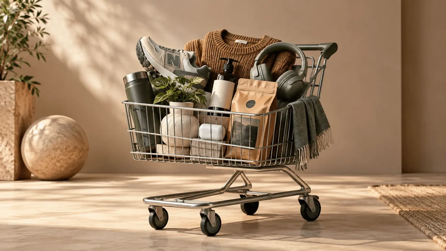
Why the step to the basket often feels too big
Increasing add-to-basket actions usually does not start in the basket, but on the product page itself.
A visitor only clicks the buy button when the product, benefit, price, variant, trust and next step are clear enough.
Many web shops only look at the basket when orders fall behind. That makes sense, but it is not always the right place to start. If visitors view a product page but rarely click “add to basket”, the friction arises earlier. Then someone is still hesitating before they even reach the basket.
That hesitation can be small. The product image does not show enough. The variant choice feels uncertain. The price is clear, but the benefit is not. Delivery and returns are hidden somewhere. The button is visible, but the context around it does not convince. The result is that visitors look, compare and leave without a clear action.
At BrandMonks we therefore see the add-to-basket action as a micro-conversion. It is an important moment between interest and order. If you want more visitors to reach the basket, you need to make the product page not just prettier, but above all easier to decide on.
First determine which part of the funnel is leaking
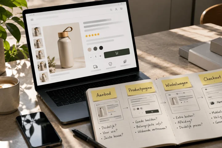
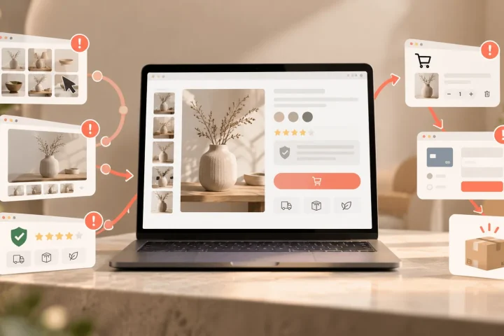
Not every case of low sales comes from the same step. Sometimes visitors barely view product pages. Sometimes they do view products, but add nothing to the basket. Sometimes they do add, but do not complete the purchase. Each scenario calls for a different improvement.
If product pages get lots of visitors but few add-to-basket actions, the problem usually lies in understanding, persuasion or confidence in the choice. The visitor sees the product, but does not yet feel enough reason to take a first step towards buying. That is different from a basket or checkout problem, where someone has already chosen but drops off later after all.
That is why you need to look at the step from product page to basket separately. How many people see the product page. How many click the buy button. Which products have strikingly low add-to-basket actions. And how do those pages differ from better-performing pages in images, text, price communication, variants or trust.
For the broader page structure, increasing product page conversion is the logical companion. This blog zooms in more specifically on the moment before the click.
Above the fold, the choice should already feel logical
The part above the fold determines whether someone understands what they are looking at quickly enough. A visitor does not need to know every specification there yet, but should feel they are looking at the right product and that continuing makes sense. If product, price, variant, benefit and CTA do not come together there, the step to the basket gets heavier.
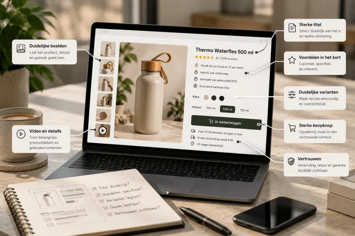
A strong top section of the product page quickly answers five questions. What is this product. Which version am I looking at. What does it cost. Why is this interesting. And what is the next step. If one of those answers is missing, the buy button can be as eye-catching as you like, but the visitor lacks certainty.
That is why a buy button only works well in context. The button needs to sit close to enough information to make the click logical. A clear title, an informative main image, a visible price, compact benefits and a clear variant choice reinforce each other. Without that foundation, the CTA becomes a loose element that has to work harder than necessary.
For that order, e-commerce product page structure matters. First understanding, then depth, then confirmation. If you respect that order, the step to the basket naturally gets smaller.
The buy button should stand out without forcing the decision
The add-to-basket button matters, but it is rarely the only problem. Of course the button must be visible, have enough contrast and be placed logically. But a bright button on an unclear product page solves little. Visitors do not click because a button shouts; they click because the decision feels logical.
A good buy button supports the moment when someone is ready to move on. The text must be clear. The button must not compete with all sorts of other actions. And on mobile it must stay within reach without blocking important information. Especially on product pages with many variants or long content, visibility matters, but always comes second to clarity.
Microcopy around the button can help too. Short lines about delivery time, returns or secure payment can make the step just that bit easier. Not as a long explanation, but as compact reassurance. The button then becomes part of a buy box that inspires trust, instead of a standalone call to action.
Choosing a variant should not take brainpower
Many visitors do not add a product because they are not sure which variant to choose. Colour, size, contents, bundle, material or version can all cause doubt. If the variant choice is unclear, people put the decision off.
Good variant presentation quickly shows what changes between options. With visual variants, the image should change along with the choice. With functional variants, the difference should be explained briefly. With sizes or contents, the visitor should get enough context not to have to guess. The easier the choice feels, the lower the barrier to the basket.
This is especially important for ranges with lots of similar products. If every product page presents variant choice differently, the shop feels less calm. A fixed variant logic per product type helps visitors choose faster and helps teams publish new products faster. We go into this in more depth in variant presentation on the product page.
Price and benefit must be clear at the same time
A price on its own says little. Visitors want to know whether that price feels right for what they get. If the benefit, quality or contents of the product are not clear enough, the price is more likely to seem too high. Then someone does not even have to consciously drop off; they simply do not feel enough reason to click.
That is why price and value need to be explained close together. Not with exaggerated claims, but with concrete benefits, product details and visual proof. What makes this product handy. What is included. Which quality or use case justifies the price. Which doubt does it remove.
Strong USPs help here, as long as they stay concrete. “Premium quality” is weaker than a benefit that is visible or provable. Think of material, finish, ease of use, contents, compatibility or result. For that translation step, showing USPs on the product page is a good fit.
Trust must already be there before the click
Some visitors do not click “add to basket” because the product is unclear. Other visitors doubt the purchase itself. Can I return it. When will it be delivered. Is this brand reliable. What do other customers think. Are the costs complete. Those questions should not only be answered in the checkout.
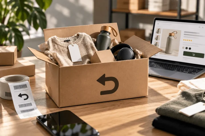
Around the product page CTA, short trust signals are often enough to lower the barrier. Think of delivery, returns, warranty, review score or secure payment. It is not about as many badges as possible, but about the right reassurance at the right moment. A visitor who is about to click does not need lengthy terms and conditions. They need confirmation that ordering feels low-risk.
Product images play a role here too. Good visuals make clear what someone gets, what the product looks like, how big it is and which details matter. That way they reduce doubt before someone has even read any text. For that visual layer, product images for more conversion takes you deeper.
Mobile calls for less friction and more rhythm
Many product pages are viewed on mobile, but not every mobile experience makes adding to the basket easy. The button sits too low, variant choices are awkward to use, images take up all the space or important information is spread over too many scroll moments. Then the visitor loses their buying moment.
A sticky add-to-cart can help, but only if the basics are right. If someone does not yet understand which variant they are choosing or why the product is worth it, a fixed button at the bottom of the screen does not improve the decision. It mainly makes the action more visible. That is useful once the doubt has been sufficiently removed.
On mobile it is therefore all about rhythm. First quickly understand the product and variant. Then see the main benefits. Then gain trust and be able to click easily. Every scroll step should add something to the decision. If mobile product pages stack too many loose blocks, adding to the basket becomes unnecessarily hard.
After the click, the next step must be clear
The experience does not end as soon as someone clicks the buy button. Right after that, the web shop must confirm that the action worked and make clear what the next step is. A subtle notification can be enough, but for many products a basket drawer or confirmation block works better. The visitor then sees what has been added and can choose: keep shopping or check out.
That moment is sensitive. Too much upselling, pop-ups or distraction can disrupt the purchase intent. But no feedback at all creates uncertainty. The best experience confirms the choice, shows the key product information and offers a clear next step.
If you want to get more products into the basket, cross-selling can make sense. But only when the suggestion is relevant and does not disrupt the main decision. A matching accessory or bundle can help. An aggressive offer at the wrong moment can actually cost trust.
What to improve for each symptom
Not every product page needs the same change. The comparison below helps you choose the right layer before you start changing buttons, colours or blocks at random.
| Signal | Likely cause | First improvement | What BrandMonks looks at |
|---|---|---|---|
| Lots of product views, few add-to-basket actions | Product or value does not become clear quickly enough | Improve above the fold, main image and benefit summary | Product page structure and visual hierarchy |
| Lots of clicks on variants, few additions | The choice feels uncertain | Make differences between variants more visible and simpler | Variant logic, image switching and choice guidance |
| Lots of scrolling, few clicks | The most important information comes too late | Bring price, benefit, trust and CTA closer together | Order of content blocks |
| Low add-to-cart on mobile | CTA or choice elements are hard to reach | Improve mobile rhythm and consider a sticky CTA | Mobile product page structure |
| Lots of additions, few orders | The friction comes later, in the basket or checkout | Check costs, delivery, payment options and trust | Transition from product page to basket |
How BrandMonks improves the step to the basket at scale
For one product you can solve a lot by hand. For a web shop with multiple products or variants, that quickly becomes unworkable. Then you do not need one-off optimisations, but a repeatable product page approach. Which information goes at the top. Which image roles are needed. How are variants shown. Where do benefits, trust and CTA go. Which parts change per product and which stay fixed.
That is exactly where BrandMonks adds value. We combine visual content, copy and structure into product pages that are understood faster and feel more consistent. For larger ranges, we translate that logic into templates, components and fixed content rules. That way the step to the basket is not reinvented for every product, but becomes part of a scalable web shop approach.
That way of working also fits conversion optimisation. Not as a collection of tricks, but as a way to bring less doubt and more clarity into the customer journey. More add-to-basket actions then do not come from pushing harder, but from making buying simpler.
Frequently asked questions about increasing add-to-basket actions
How do you increase add-to-basket actions in a web shop?+
Start on the product page. Make product, price, benefit, variant and CTA clear straight away. On top of that, make sure you have good images, concrete USPs, visible trust signals and a mobile experience in which the buy button is easy to reach.
What is a low add-to-cart rate?+
That differs per sector, product price and type of traffic. So mainly look at differences between your own product pages. Pages with lots of visitors but few add-to-basket actions often show where images, text, variant choice or trust fall short.
Does a sticky add-to-cart help on mobile?+
A sticky add-to-cart can help if visitors already have enough information to choose. If the product page itself is unclear, a sticky button will not reduce the doubt. Improve the decision information first and then use sticky behaviour as support.
Should I make the basket button bigger or more eye-catching?+
Only if the button is currently hard to see. Often the problem is not the button itself, but the context around it. A clear button only works well when the visitor understands what they are buying, which variant they are choosing and why the purchase feels logical.
Conclusion: more add-to-basket actions come from less doubt
Increasing add-to-basket actions is not about one button or trick. It is about whether a visitor feels certain enough to take the first step towards buying. That certainty comes from clear product information, strong images, an easy variant choice, clear price communication, visible trust signals and a logical CTA.
The product page is the most important moment in this. That is where interest turns into action. If the page leaves too many questions open, the basket stays empty. If the page makes clear faster what someone is buying and why it feels low-risk, clicking the buy button becomes much more natural.
For BrandMonks that is the core of good e-commerce content: not just presenting beautifully, but making the choice easier. With smart product page structure, converting visuals and repeatable templates, you can bring more visitors to the basket and apply that improvement at scale across your range.

Melle Sikma
Helmsman
melle@brandmonks.nl